Watch the video here (https://vimeo.com/511290721)
TRANSCRIPTION:
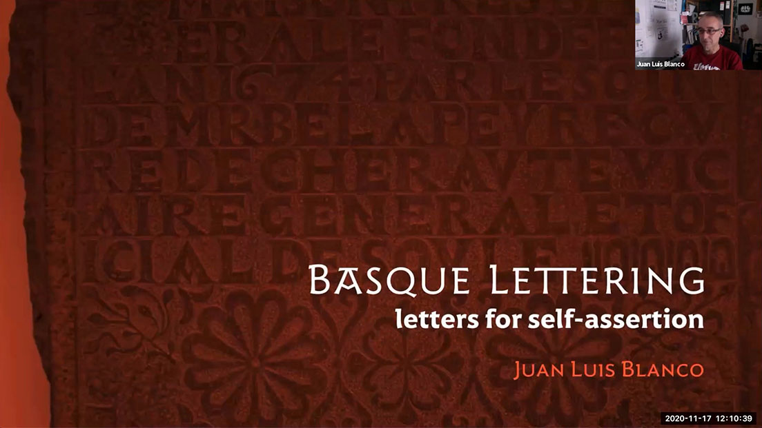
I’m pleased to now introduce our speaker today, Juan Luis Blanco. Juan Luis Blanco is joining us live from the Basque Country. It may be lunchtime in California, but in Euskadi, it’s time for dinner pintxos washed down with a Rioja alavesa.
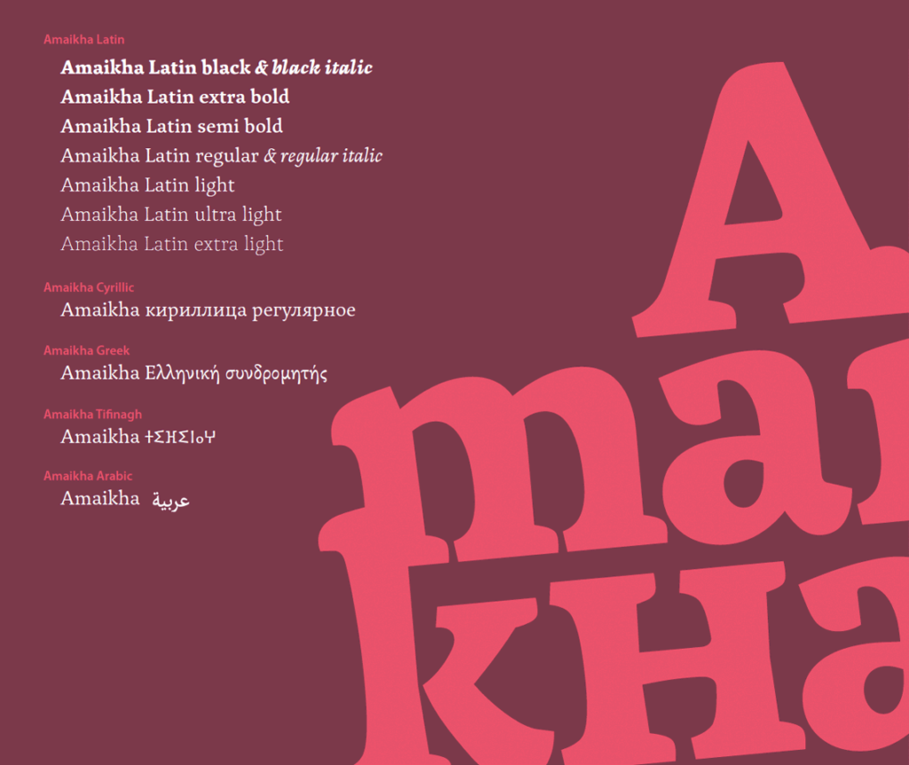
Juan Luis Blanco is a graphic designer, a type designer, and a calligrapher based in Zumaia in the Iberian Peninsula, otherwise sometimes called Spain. I don’t want to step on any Basque toes here. In 2013, Juan Luis studied at the University of Reading and earned his MA in typeface design, and it was there that he developed Amaikha, a multi-script font family comprising Latin, Greek, Cyrillic, Arabic, and Tifinagh glyphs.
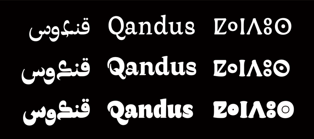
Currently, he’s returning to his roots, and his focus is on the Basque lettering style and multi-script typefaces. And recently, he collaborated with Christian Sarkis and Laura Meseguer, who I noticed is here today with us, to produce the multi-script typeface Qandus, which was awarded a Type Directors Club Certificate of Typographic Excellence in 2017. And Juan Luis’s typeface Harri, which is a contemporary take on traditional Basque lettering, is now in the Adobe Font Collection.
Yay! And when he’s not designing typefaces, Juan Luis is off in the countryside looking for inspiration, rock climbing, one of these athletic types. So I always ask our speakers for an amusing or hopefully embarrassing anecdote to recount. Well, Juan Luis told me a story about when he was a small child, he was helping his father, who was a sign painter, and they had to climb up a super high and very sketchy scaffolding to paint a sign in the Basque lettering style.
And Juan Luis thinks that actually anyone attempting to use such a precarious scaffolding like that one nowadays, especially bringing your small child up to help, they would immediately be arrested. Anyways, many years later, as Juan Luis was perusing a book on Basque writing, what should he see but a photograph of that very sign? So Juan Luis imagined how proud his father would have been to see his sign in a book, or to see his little son Juan Luis presenting on Basque lettering today. Ah, what a heartwarming tale, but Juan Luis, I asked for dirt, not scaffolding.
That was way too wholesome. Okay, without further ado, I present Juan Luis Blanco.
— — —
First of all, I want to thank the people at the Letterform Archive for the invitation and for the interest in this subject.
Thank you very much. So let’s start because I have quite a lot of things to tell you today. So what do we call Basque lettering? Well, I understand that for many of you this is a new subject.
So before I start, I’ll try to answer quickly to this question. And for that, nothing better than a bit of shock therapy. So Basque lettering is everywhere in the Basque Country.
It is extremely peculiar, it is quite unique, it is heavy, it is so crazy many times. Let’s see now a bit of the context. Well, first of all, let’s locate where the so-called Basque lettering takes place.
This is more or less where the Basque country is, south of Europe. So let’s zoom in a little bit. Well, this is a much better scale to explain what the Basque country is and it is also a scale where things get slippery and a bit tricky, as Grendel said before.
So I’m showing the map of Euskal Herria and even if most of you have not realized yet, I’m already talking about politics. Euskal Herria is the literal translation of the term Basque Country into the Basque language. But the meaning of Euskal Herria is a bit wider.
So let’s add some lines which are what make maps political. And as you can see, the territory now is divided in seven areas. Each area is a province of Euskal Herria and these are the Basque names of those provinces.
And what you see here is the coat of arms of Euskal Herria, which very often goes together with the motto Zazpiak bat, meaning we are seven but one. So this idea of Euskal Herria came into being at the end of the 19th century, at the time when nationalist movements started to show strength in Spain. It has been an influential force in the political scene of the Basque country since then.
And this is important to understand some of the motivations behind many creative ventures in the 20th century in the Basque country, including of course design and lettering. So I showed you what Euskal Herria is, but reality is always complex. So we see the actual borders and administrative units of the Basque country.
Two of them in Spain, the autonomous community of the Basque Country, or as we call it Euskadi, and the autonomous community of Navarra or Nafarroa. And the three French provinces in blue, which are part of the Atlantic department in France. So there is a long way from the actual state of affairs to the aspirations of many people for an independent united Euskal Herria.
And of course, there are also people who don’t agree with that idea and are happy with the current situation. And this has generated the tension that has had a great impact on the political scene of the Basque country for more than one century. And regardless of each one’s position about the Basque country as an independent country, there is a strong feeling of identity fostered to a high degree by the existence of a unique language, Basque or Euskera, as we call it.
So what can I say about Euskera? Where does it come from? Where is it related to? So here you go, an interesting tree, illustrating beautifully all the links and roots of Indo-European languages. I don’t know if you see Basque. I know it is a bit hard, but I’ll give you a hint.
Look at the cats at the bottom. Yes, they don’t find it either. So Basque is not there because there is no conclusive theory about its origin so far.
It is actually regarded as a language isolated. That makes it extremely interesting for linguists and a treasure to be preserved and fostered for its speakers.
“De hecho, podríamos probar hacer esta presentación en español, que a mí me resultaría mucho más cómodo seguramente, y habría mucha gente en San Francisco que entendería o les sonaría familiar”.
So this is Spanish and probably it sounds familiar to you.
“Baina imajinatu aurkezpen hau euskeraz egiten dudala. Euskal Herritik hau ikusten ari diren gutxi batzuk kenduta, inork ez luke tutik ulertuko”.
So this is Basque and it’s a pity I cannot see your faces now. I said briefly that no one would understand this talk if I gave it in Basque, apart from some people watching it from the Basque country.
Well, I’ll go on. So this is the picture of the Basque language nowadays and you can see in the map its use is not uniform in the different provinces. It’s no longer an endangered language, fortunately, but it has gone through harder times in different periods in the past, with times where its use wasn’t allowed in some areas.
Some scholars still regard it as vulnerable. So I hope this gives you an idea of the context in which the Basque lettering took place. So let’s go back in time to see something about its roots.
When we talk about the origins of Basque lettering, we have to talk about inscriptions and gravestones. And if we talk about gravestones, it’s unavoidable to talk about this book, The Basque Stone, because we know about Basque gravestones thanks to this book by Luis Colas, published in 1923 in Biarritz. The Basque Stone is a collection of more than 1,000 inscriptions drawn by hand.
In Luis Colas’ work, they needed to be documented before they disappeared, as most of them suffered strong weathering. Another interesting thing is that every illustration includes a text with information about the kind of stone, its location, the text on it, and sometimes details of the inscription or the stonecutter, if known. Here you see the effect of weathering in a couple of inscriptions.
In any case, we still can notice the peculiar lettering showing low-contrasted uppercase letters. By the way, all descriptions I’m going to show have an important feature in common, but I will let you discover it. New inscriptions allow us to see smaller details.
We see here the typical widening at the end of the stems and bars that is customary in in-size letters, and will be later exaggerated in Basque lettering, as we’ll see. So it’s there here, here in the T-L-I, all these places. And on the contrary, in some older inscriptions, it is even difficult to recognize the characters, like those ones on the right.
This is one of my favorite ones, dated 1633. I love this blur effect caused by the erosion on sandstone. Again, we see low contrast, or not contrast at all, and uppercase letters with a geometric construction.
In this case, big triangular serifs are used here in the S, and other letters too. V is used for both U and V characters, as was customary in Roman inscriptions, and later in Basque lettering. Here you have more examples.
These ones are inside churches, which seems like helpful for the preservation, until you realize people walk on them. So an interesting thing is that words are written in a continuous way, and split by dots. Like, you know, there’s dots here and here.
Okay, more inscriptions on the floor. Look at this nice variation of Z, to fit between the shapes of the surrounding letters. And the same phenomenon here is like, here O and S change size and orientation to fit the surrounding shapes, creating beautiful compositions.
These two inscriptions are very well preserved, mostly because they are in a museum. So this is the Basque Museum of Bayonne in the French Basque country. I cannot tell whether they were selected for the museum because of their special significance, or they have gained special significance because they are in the museum.
In any case, I regard them as extremely influential in the later definition of the Basque style. The one on the left being more informal, and the right one being more controlled and heavy. In fact, none of the inscriptions contains all the variants and modifications that will later be adopted in the Basque style.
The result is probably the product of a selection of the most characteristic letters found in different inscriptions. This is why I want to show you this one. It is a scan from Colas’s book.
Here you see the characteristic A, the most repeated and noticeable variant of A in Basque writing, this one here. There is also a mixture of lowercase and uppercase letters that we will see in early examples of Basque writing in the 20th century. What we’ve seen so far is not exclusive of the Basque country.
These ones are in the UK, but I have seen similar examples in other places. Both the technique and the style are extremely similar. Look at the A’s.
Okay, this A here, that one there. This construction of the A is regarded by many as typically Basque, and I was really shocked when I found it in these pictures. This one I found it in the south of Spain.
Look at the A again. Here, that one. In principle, considering that similar inscriptions were found in other places, this peculiar style could have flourished in any of those places, but it didn’t.
Why? I think no-one can answer this question, but it actually did in the Basque country. The way it evolved and the way it is used is unquestionably linked to the notion of Basqueness. Even if it shares a common root with other styles, I haven’t found this sort of transformations in other places, neither its customary use as an identity conveyor.
Now, did you discover that thing that all these inscriptions had in common? Well, here is the answer. Unlike the Roman inscriptions, where the stonecutter carves the letter itself, in all the inscriptions we’ve seen, the technique is the opposite, resulting in raised letters. Here, the letters are produced, removing the space between them, so letter forms stay at the front and the spaces go down.
This has an influence on the weight of the letters, so you could never go as thin as Roman capitals with this technique. The picture on the right, this one, shows a work by Eric Gill, extremely well executed, and this is probably the thinnest you could go. Apart from the weight, this technique can affect the shape of the letters, as the Basque artist John de Zabalo points out in this illustration.
A convex shape may create a concavity in the next character. It is also a good way to save space and create peculiar shapes, as we will see. Finally, here at the right bottom, you can see my try during my Master’s Degree in Reading (UK), and I have to say I found it extremely difficult to cut properly the small details with this technique.
So, let’s go back to this inscription and look at it in detail. Probably it is not an example of a precise execution, but I find here lots of features that will appear later in many instances of the Basque lettering style. In 1, 2, and 3, we see convexity, concavity, construction, how the shape of one letter influences the shape of the next one or the previous one, and in this case especially, if you have this shape at the right and you have a symmetric letter, probably you will do the same or you will try to make the same shape at the left.
In 4, we see an asymmetric use of serifs just at the top. In 5, this elongation of serifs or strokes to fill the space, that is very common also. In 6, a tweak of serifs to adapt to surrounding letters, so this serif in letter E and that one in letter B are different, just because letter B is placed before.
In 7, we see combinations of letters to save space, and in 8, I just pointed out that the use of dots instead of spaces. Well, 9, 10, 11, and 12 show an interesting use of space between letters. If there is some space left, you play with it and you elongate the leg of the R or the stroke of number six, but if not, you adapt the shape to the surrounding letters, like here, the sequence VLA.
And 13 and 14, I left them for last because I found them so funny and irreverent. The stonecutter respects the conventions for the uppercase letter until he runs out of space, then it’s time for creativity and for breaking free from all the constraints. So you can cross a baseline, like here, or change the structure of a letter, like this fantastic T at the top.
Well, what we call Basque lettering is a revival of the letter forms we’ve seen, linked to Basque cultural movements and nationalist organizations who took it as an essential part of their symbology. Here we see three periodicals linked to the nationalist Basque party known as PNV. Here we don’t have anything like Basque lettering yet, but I think they capture the spirit of the first pro-Basque movement, a spirit that is embodied in some small details.
So look at the diacritics. They are not such diacritics in Spanish, they are following the orthographic rules proposed by Sabino Arana, the philologist, founder of PNV party and a key figure in the history of nationalism in the Basque country. The names of the periodicals are Basque, but if that wasn’t enough, the use of those diacritics mark clearly we are reading in a different language.
This is an enlargement of Baserritara. Things become interesting here because we see those diacritics used in the smaller text. It doesn’t seem difficult to add diacritics to the headers, but body text is a different thing.
Quite likely you need to cast a custom font. Well, actually more than one because you have several sizes here. You wouldn’t devote such a big effort if you were not convinced of the importance of making visible the difference between Basque and Spanish languages.
So this is again the sign of a trend, a trend that in this particular case seeks to define visual boundaries between two linguistic realities. At about the same time in the French Basque country, Luis Colas had already started to collect and classify inscriptions. He spent 17 years on that task.
He finally saw his work published in 1923. The coverage shows that after those years he has come to master all the skills and tricks he learned from the inscriptions and wants to show them off. On the right you see the bulletin of the Basque Museum published one year later.
It shows a similar treatment. This is not surprising considering that Luis Colas was one of the collaborators in the bulletin. Well, as new books about Basque culture and traditions are published, we see more examples of lettering and also more stylistic variants.
Most of these covers were designed by artists and illustrators whose knowledge about typography and lettering is surely different in all cases. On the left we see Jean-Paul Tuyac, a prolific artist and creator of countless works and illustrations related to the Basque culture and traditions. On the right a book about the Basque ball game cover designed by Paul Garamendia displaying a distinctive Q and the elongated stroke ending in E and L, this one that we will see many times later on.
On the left another cover by Jean-Paul Tuyac which shows quite a consistent style both in his folkloric illustrations and in his lettering where he uses uppercase letters exclusively. On the right a book uncovered by Jacques Letaner, he uses more regular letters in general, apart from this cursive E here. And as you can see the word Basque is present in most of the titles of the books.
So we can see that this lettering plays the role of a branding element for the groups promoting the Basque culture. We are already in the 30s and this cover on the left keeps some of the features we’ve seen before but the overall look is heavier, wilder and much more expressive. While on the right you see Joaquin Zabaleta and here the design of the header is much more controlled and precise.
It was published in San Sebastian, the previous one in Bayonne. Jaquin Z is a key publication to understand the movement called Euskal Pizkundea, meaning Basque Renaissance. But to me the interesting part of Joaquin Zabaleta is in the inside because it is the first publication I found where there is a consistent design in the inside.
All the headers of the sections are designed following the style on the cover. In this page on the left there is also a direct mention of the Basque Renaissance. It is also worth noting the capitular that opens the paragraph in this page here, as well as the header of the bibliography section on the right, that one.
It is a fairly well constructed geometric sans that displays a small serif at the top of the stems. This asymmetric use of serifs is also a common feature in Basque lettering and here is evoked in a subtle way. This is the first bilingual sign known in San Sebastian.
It is written in Spanish and Basque using stylized Basque lettering. It was also the first academy where you could receive classes in Basque. The academy was also the headquarter of Beñat idazkiak, a publishing house focused on Basque topics.
They started several collections. Here we see the one called Egia Sorta which seems influenced by the works from the French Basque country we saw before. We see again the diacritic on top of the R and an apostrophe to differentiate the root of the word from its suffix. None of these things are currently used in Basque writing.
This will have different orthography now. In red you see the lauburu, one of the many solar symbols used in inscriptions that has become a visual synonym of Basque because of its extensive use. This is Zabalkundea Sorta, another collection from the same publishing house.
Here traditional and modern graphic styles are mixed with Basque lettering creating a different look in every issue. The lettering style used on the cover of Garoa on the right is already very close to some of the archetypical shapes currently used. But the way the cover on the right was designed by John de Zabalo, an influential figure in the field of Basque lettering as we will see.
Well, and then, in this horrible year, 1936, this lively and vibrant publishing activity had to be stopped, at least in Spain because of the civil war. The civil war had dramatic consequences for many people but those that had been involved in any activity related with Basque nationalism were in a really awful position. All the peripheral nationalist movements in Spain supported the republic so they were hardly persecuted during the war and later during Franco’s dictatorship.
In the post-war period many people involved in activities linked to nationalist movements fled the Basque country seeking safer places. Many arrived in Argentina and founded a publishing house as a way to set up the political and cultural resistance overseas. The design of the publication had to have an undeniable Basque style and of course typography played an important role in this respect.
The Basque appearance of the letters are emphasized as if they needed to shout their origins. The most influential publication in this collection in regard to the Basque lettering style is Arquitectura Popular y Grafía Vasca (Popular Architecture and Basque Lettering), written by John de Zabalo, whom I mentioned before, with his brother Pablo. At the time, John lived and worked in London and Pablo in Venezuela.
The book was eventually printed in Argentina by Ekin. Somehow John de Zabalo completed the work of Luis Collas with a more methodical approach. The result is a sort of letterform catalogue in which one can find a myriad of shapes to take inspiration from.
Many times I wonder how the Basque lettering has ended up having such a strong and distinctive character. Well, I think the answer lies in this sentence I highlighted in John de Zabalo’s book explaining his selection criteria: “so I have been careful to collect those letters that have some particularity that makes them more ours”.
So saying “more ours” means more Basque, more distinctive. If you focus on what is different, you will very likely avoid conventional shapes. So it would have been strange not to end up with a bunch of extremely distinctive letters.
So this is the 50s already. This is the Itxaropena publishing house. They published a series of books about different aspects of the Basque culture called Kuliska Sorta.
They somehow managed to avoid censorship and published several works in Basque language, which was quite an extraordinary thing at the time. Free interpretations of the Basque lettering style are made in most of these covers. Well, we’ve seen a bunch of literary works so far, but I want to go back to inscriptions to show you this memorial carved in 1966.
I know it quite well because it is just 15 meters away from the place I’m right now. I love the way the author breaks the rules regarding height and alignment of uppercase letters, maybe in a naive way, but certainly with freedom. It took me time to learn how to look at these unorthodox letters with an open mind.
Now I need to thank here Gerard Unger for his brilliant analysis of Romanesque letter forms, because it was a great inspiration to me. Okay, about this period we start seeing dots in many letter forms. I don’t know where they come from, certainly not from the inscriptions collected by Collas.
On the left there is a version of Basque letters with dots used everywhere, as a way to add a visual consistency to letter forms. The cover on the right displays a modern and confident Basque style, and we see the dots used as terminals in the lower stroke of letter K. This is something that we will see later many times also in a similar position in letter R. Well, we are leaving the 60s and entering the decade of the 70s. Franco’s dictatorship is in the last period and censorship is much softer now, and more and more publications in Basque language are printed.
Here you go two album sleeves where modern aesthetic trends and traditional Basque style coexist in an interesting way. The lettering, as in all the examples we’ve seen so far, is drawn by hand.
Well, this is an interesting book. It is a facsimile of Luis Collas’ book with a different title. The translation would be Basque Lettering, Ornamentation and Symbology. Two interesting things about this book. First, and very important, it made available an exceptional document otherwise impossible to acquire, which is really good for anyone interested in lettering and ethnography. And second, there are six new pages added at the end of the facsimile. There we find an illustration with a Basque alphabet.
This one displayed was not in the original publication. It is the first instance of a model of Basque lettering I found, and the style corresponds with the dotted design we saw earlier. So we are already in the 70s, the decade Franco’s dictatorship ended, so a new time of freedom is coming.
The growing importance of movements in favour of Basque culture during the late 60s suddenly explodes in the 70s, and so does the amount of publications using Basque lettering. It would take weeks to comment on the examples and all the different styles and variations that emerge at this time and during the following decades. Some of them follow a more idiosyncratic path, and others try to bring it closer to conventional forms, as in the three examples here at the bottom right.
Well, from this point on you see Basque lettering everywhere. These are some examples of packaging. You see here cider, milk, cheese and beer. Basque lettering is mostly used in local products, and more likely in those in which its Basque origin is considered a positive value.
And here you see the visual landscape on the streets of the Basque country. This is just a super short selection. So they are not here to show quality, but to stress the immense variability of letter forms. Interestingly, in a few of these cases, being Basque would not add any value. This is just an expression of identity by their owners.
They state that we are Basque, and indirectly we speak Basque, something that would probably be a bit risky 20 or 30 years before. We start to see fonts or font-based signs here, but the majority of them are drawn, including Tellendi, that one here on the right, which has a special place in my memories, as it is the one Grendl talked about in the introduction.
These are also street signs, but they are in the French Basque country, and even if there are quite a lot of common features, I see a different taste. Black variants exist, but they are not used as widely, and when they are, they have a more playful style. In general, lighter and more orthodox styles are used on the French area. We also find examples that evoke the first designs of the 20s, or even the early inscriptions, but to me one of the most interesting expressions of the Basque lettering style that you would only find in the French Basque country are the tombstones. It is as if the Basque lettering would have recovered its original function with a renewal of the style. There are lots of tombstones carved in this style, quite likely with the help of modern machinery, but the result is extremely pleasing to me. Most of the devices and tricks we’ve seen in other examples are beautifully applied here in order to squeeze the space between letters. It seems that the game consists in defining the letter from sticking away as little material as possible.
Now in this slide, I’m not interested in the place where I found these examples. The question I would make is where are the products or here from? So on the left you know that the objects of this “Pays””, (French word for country), will be Basque. You know that the “Baztan” restaurant located in Barcelona will serve you Basque food, and you know that in these bottles there is Basque cider, regardless where you bought them. This is a remarkable phenomenon. You don’t find easily this strong and unmistakable link between lettering and place, at least it’s not common these days as Matthew Carter pointed out.
this is a quote, it’s a direct quote, by Matthew Carter in an interview:
Once I could be parachuted blindfold anywhere in the world, take the blindfold off and look around, and I could see the shop fascias and newspapers, and I would know where I was just from the typeface. I’d see the type for Rogger Excoffon and know that I had landed in France. But now a typeface is released in Tokyo, Berlin, or London, and it’s gone around the world overnight, and it has completely lost its sense of origin.
So this sense of origin is a main role in this story. It is essential to understand the way Basque lettering has been used and how it has spread. Basque lettering is actually a way to state your identity, but also a way to mark a territory.
So if I write this now, do you think I’m referring to Santa Barbara in California? If you don’t, you’re right, because this is Santa Barbara in Gipuzkoa, a really nice place for rock climbing, actually.
But this is not only about origin, place, or identity. There are plenty of meanings that can end up attached to certain letter forms for many reasons. Their design and sources are certainly important, but the way they have been used is not less important. Remember the use of black letters by the Nazis. The case of Basque lettering, its use has been very often linked to folklore, to ancient legends and traditions, to the countryside, and in brief to a conservative and romantic idea of the Basque country. So less than one mile north from Santa Barbara, you find this building.
It is a leading company in the field of technology. This is also the Basque country, to the same extent as the previous picture is. The name of the company is Oorona, what you see under the picture is the logo.
Well, it is the logo they used in the 70s. You already see the problem here, don’t you? Other companies had experienced the same problem. So we see this trend with the change of the century. Many companies update their brands, some of them in a sort of smooth transition from Basque lettering to a formally related typography first, and to completely new and neutral look eventually, as we see in the case of Caja Laboral here on the right. The guidelines are no longer related to identity or ideology, but to visual effectiveness and utility.
Related to this, I want to share with you a case study that illustrates this trend. This was the main point in a brief I got years ago to the design a logo: “We want our logo to show an unquestionable Basque flavour but without using that ugly cider house typeface” I don’t need to remind you what they are referring to with the cider house typeface, but just in case, I put it here.
So this was the proposal they chose. Structurally, it has some resemblance with some of the more formal inscriptions we’ve seen before. I just modified the O. It was reduced and raised, replicating the space-saving techniques of stonecutters. That was the closest to Basque style I was allowed to get.
But what if you are asked to design the logo of an actual cider house? Then you can take advantage of the huge amount of Basque lettering variants and choose a solution that meets your needs. In this case, the brief was also stated in a negative sentence. We are a cider house, and we don’t want to use anything related to apples as every other cider house in the Basque Country. So that sounded like music to the ears of someone eager to propose a typographic solution. Nice music actually considered the unusual stacking of four R’s when the two words were aligned to the right. So I choose, of course, the variants of the R with dotted legs, and here you see the result. We get a strong typographic image that resembles the “lauburu”””, the solar symbol present in many gravestones, and also in traditional furniture decoration.
So in brief, the explosion of Basque lettering in the 70s could have made sense at the time, but now we see that it starts to be used in a more practical way. Well, I know this talk was about Basque lettering, but this lettering has inspired typographic works at different times and using different technologies. So let’s have a look to them.
This is a specimen of Richard Gant’s foundry. It was a nice discovery in 2016, but then in February 2020, I got a call from a friend who had a friend who bought some type in a street market, asking whether I found it of any interest. So she made my day, for sure. This is the first metal type of this kind I’ve ever seen, and it corresponds to the printed specimen.
Here we see this Letraset sheet. Well, the demand of the Basque letters would have been clear to Letraset when they decided to produce this special edition for a well-known stationery store in Bilbao. I don’t know who is the author of the original lettering, but for sure they preferred the wilder and more eccentric variants over the more conventional ones. The design seems really weird to me, but I have to say I’ve seen it used many times.
Here we see one of the first fonts, digital fonts available, and one that has been extremely successful. The font has two sets of uppercase letters. The one at the top is decidedly crazy, excessive, and blatant. It is full of asymmetries and streaking details, like the huge dots in letters R and K. So look how far this trait has gone from the first time we saw it. The second set at the bottom still has a lot of character, but compared to the first one, it seems shy and well-behaving. Both of them are extensively used, but you would be surprised how many times the first one is preferred.
All right, here we have a weird story. One day an international auction of Basque fonts was announced in the media. I’m not going to get into the details of it. It’s enough to say that it was a fake auction in the context of an artistic project, and that the actual authors of the fonts didn’t like it very much. To me, the most interesting side of this fake auction is that they collected most of the Basque digital fonts available at the time and put them together in the leaflet, which is quite likely the only printed document that displays so many Basque fonts. This is the back of the leaflet, the collection of fonts.
Another weird story here. This is the “Bilbao” typeface, designed in 2000 for the Bilbao City Council. It was an attempt to design a standard font blending some of the more characteristic features of the Basque lettering. One of the goals of the project was to promote its use in the city urban signs and fascias, which would work also as an element of urban identity. To achieve that, they made it easily available and offered it for free on the city council website. And this was the proposal for that font, clearly designed over an existing font that many of you probably would recognize. Alfabeto Bilbao was freely available for some years before it was removed from the website, a good opportunity to make an interesting typographic work was lost.
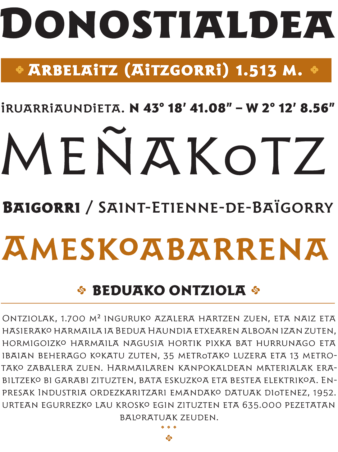
Well, here you see the first sketches for Harri, my proposal for a Basque typeface. Well, at the time I not only wanted to design a versatile, usable, high quality and well-drawn typeface. I also wanted it to be light, to be the lightest Basque font ever designed, in contrast with the ultra heavy variants I used to see everywhere in my daily life. So I started drawing by hand, thinking it would not take me long to finish it. And of course, I was wrong.
I reached to the point where I thought, well, this thing is much bigger than I thought. I need to find a place to learn how to move on with this. So that’s why I decided to spend one year learning type design in Reading.
Harri, sorry, I need to pronounce it in the right way. Harri, in which this H is not pronounced and the R is strong. Harri display was eventually published in 2017. To me, it was important that apart from that light style, it had a reasonable range of weights, ending in an extra bold that would be equivalent in blackness to the variants most used.
None of the fonts designed so far had more than one weight. So that was already an important step forward. I also designed a second set of uppercase letters, slightly shorter in height, and an extensive character set to cover as many languages as possible.
And yeah, these are my Basque letters. I think they’re elegant and refined, but maybe now I see them as too refined. Anyway, the question was, can I make them behave like Basque letters? Can I make them playful? Can I combine letters or use different shapes depending on the context? Can I also explore ways to save space as all stonecutters did? And the answer is yes.
Open type standard gives you a lot of choices when you design fonts. So do you see the difference and how recently space has been saved? And do you see what would change here? Well, actually many things change. So let’s show it more clearly now.
So these are all the characters that were changed using discretionary ligatures and contextual alternates. The ligatures are here in these names. These are Basque names.
And I just decided to make ligatures for phonetic combinations in Basque. So these are Basque sounds. And here you see also how stylistic sets might be used to emphasize the Basque appearance of the text, like here in “Iñurrategi anaiak””, or to remove those features to make it more neutral, like the top here, Inchkenneth Chapel, or Apolikhnos. All the features were removed using a different stylistic set.
And of course for all these alternates and stylistic sets to work, you need to design a big set of characters. Because whenever you introduce an alternate, you need to check whether this character has diacritics and design also those composites, which is this right column here.
Well, then I wondered, would it be possible to design an upper and lowercase typeface keeping the Basque character of Harri Display? Actually, I had seen no more than two attempts to design a lowercase Basque font, and none of them seemed good to me.
So I took the challenge and started designing Harri text. I thought I had half of the work done, but to my surprise, this wasn’t the case at all. First, the regular weight of Harri Display was too heavy for text, and the light too thin, so I needed to set a new regular and rearrange the rest of the weights. And second, the proportions of Harri Display based on the Roman capitals worked very well in all uppercase settings, but it wasn’t happy with them when combined with lowercase letters.
Here you see the weight range, the new ultralight style, which made the challenge a bit more interesting. Note that there is no upper bar on top of A. You can still find it as a part of a stylistic set, but I found it a bit distracting when used in text. So the default A is now more conventional. And there is also a new set of small caps. Here you see Harri text in a paragraph.
In Harri Text, the ordering of the stylistic sets was decidedly a part of the design of the typeface. The default set is now closer to a conventional design, and the degree of idiosyncrasy can be increased by choosing the preferred stylistic set, or just removed to get a neutral style with the stylistic set number 4. Here the two extremes of this range of possibilities between neutrality and idiosyncrasy are illustrated in the poster.
And of course, a text typeface needs an italic companion. So being the name of the typeface Harri, which means stone in Basque, I didn’t think a flowing italic would be appropriate. Instead, I experimented with a still slanted style, in which small tweaks could give the letterforms a hint of cursiveness. Here you see the result.
And then you start thinking of, you know, those people who may prefer a more fluid italic style, so why not design a stylistic set for them too? And here this is a set with more fluid italics.
And this is the same set in heavyweight, where everything stands out more clearly.
And you see here roman and italics at work. So the arrangement of stylistic sets have a new axis now, solid and fluid variants. This is related to italics only. Solid and fluid variants can be now combined with the degree of neutrality or idiosyncrasy preferred.
And here you see a specimen poster… another poster with more italics.
And this is a mockup I prepared when I released Harri Text. I was actually surprised at how well it worked in this sign. Actually, I would love to see Harri Text used in signage one day, but you never know how your typefaces will be used.
We’ve seen how Basque letters have been used so far, and I wonder how they will be used in the years to come. And I really believe that many interesting things can still be done, but time will tell us which direction Basque letters will take in the future. And I hope we have another opportunity to talk about it.
Thank you. Eskerrik asko.
Eskerrik asko, Juan Luis.
We have a bunch of questions that have shown up in the chat. People, I know we’re gonna, we’re just a little bit over time, but if you want to stick around, we will try to hit some of these questions for Juan Luis. Okay, first of all, bravo, estupendo, we’re getting lots of stuff.
Thank you. We have a question from Stephen Coles, who asks, in contemporary work, is it considered a political decision to use Basque style lettering or did it become merely a cultural association without connection to Basque nationalism or separatism? Juan Luis.
I think it depends on the context you use it. I mean, if you see it in a butcher shop, it doesn’t have any implications. If you use it in more official institutions of course it has a political meaning, for sure. I mean, it’s depending on the context all the time. But, you know, I see with time that it use, I mean, more and more people are refusing to use it because of this connotation that it has related to, you know, the countryside and the traditions and all this stuff. But yeah, I would say it depends on the context.
Okay, thank you. Depends on the context, short answer.
Let’s see, we have one from Charlotte Simons who says, was there a specific style of Basque calligraphy in addition to the stone cutting?
Well, we have had the really good and important calligraphers in the Basque country. I would, I remember Juan de Iciar was one of the first calligraphers and a very big figure in the 16th century. But they normally use like the style of the time. I mean, in this case, he wrote a book about, like a sort of manual to write calligraphy and he was using the styles of the time. So the Chancery, the Italics and the Redonda, the Rondilla, all the styles that were customary at the time. But none of them, I wouldn’t say nonr of them is specifically Basque. And I don’t know nowadays of any Basque style calligraphy.
Okay, well, let’s see here. We have a question from Sophia Tai that says, can you tell more why the clients called Basque letters ugly? What was the reason they were perceived as ugly?
Well, that’s a difficult question. Probably if I was talking to you 10 years ago, probably I would say the same. They were ugly. I look at them in a different way now. Probably it is because they are tired of watching them every day. And because there are so many variants. And actually you find really awful things sometimes. So unless you have like a big picture of everything and you just try to look at the best stuff, depending on what you find around you in the place you live, you may end up with this idea of this style is pretty awful. But I probably could have said that some years ago.
So you would agree that, what happened to you? I’m gonna ask, what happened to you that you changed your mind? Now you think they’re beautiful.
Nothing, just looked longer. To the letters. I actually, I mentioned the Gerard Unger before. And he told me probably one of the most important things that he told me is how to look at letters. And his studies about the Romanesque letter forms. They were really helpful to look at these letters.
Okay, thank you. Let’s see, we’ve got it. We’ve got a lot of questions.
And put your questions in the Q&A and upvote questions that you wanna see answered because we might not be able to get to all of them. We have a question from David Koslow. And David asks, Bakersfield, California an inland city midway between Los Angeles and San Francisco has a large Basque population. Did you look at the typography of newspapers and restaurant menus from Bakersfield, California?
No, but I would love to do so. I would be very happy if this person could send me any examples of any directions that I could look at. Okay, got it.
So keep your eyes on your mailbox. I’m sure menus from Bakersfield are gonna be pouring in. Let’s see, we have a question from Delve Withrington who asks, why is the use of lowercase letters besides the I, the dotted lowercase I, so uncommon in Basque lettering and type? Sorry, could you repeat the question? Why is the use of lowercase minuscule letters so uncommon in Basque? Uncommon, okay.
No idea, I think it is because all the letter forms we’ve seen or most of them in description were uppercase. So there are just a few lowercase letters mixed. And then probably it’s, well, in the beginning you see some examples of this mixture of uppercase and lowercase, but from one point on, they are not longer used. So it’s like everything was in uppercase letters afterwards. And it’s like when you establish a style or you see a style repeated many times, always in the same case, if you want to replicate it normally, you would do it the same way. I don’t know.
Okay, let’s see. Juana Cruz, Denise asks, which software did you use to make those types with so many complicated rules of ligatures and so on?
Well, it’s made in Glyphs. Yeah, I really like Glyphs, yeah.
Okay, that was short answer. But then she has, Juana has another question. When defining your sketches of Basque lettering, should you use a grid or is pure liberty of movement the ideal?
No, no, no way. I mean, it’s, I prefer to draw things by hand. I mean, afterwards, if you want to make everything regular, you have the computer to do so. But on paper, I prefer like, you know, I sort of more fluid design. And actually, you know, I do many, many sketches before I start designing in the computer, just because the result is going to be always like, you know, more fluid, more the way I prefer.
Okay, oh boy, let’s see. Here we go.
Why, Sophia Tai asks angrily, why did you remove the tittle from the capital I letter? We’re all wondering about that, Juan Luis. Why I remove, what? Remove the dot from the I, the tittle. Harry, quizas el puntito en la I. En donde? In the capital I. Here. Yeah, where’s the dot?
Okay. Well, I choose, I mean, I could have put it there. It’s in a different stylistic set.
So, you have one with a dot. For sure. Yeah.
Okay. All right. You’re off the hook.
We have one from Apolline De Luca that says, how can you explain letters in the streets now look less well handcrafted compared to the past on graves or so as you showed nowadays they look a bit more cartoony and cartoony style. More? I mean, what do you mean with this word, cartoony? Cartoon is like goofy, silly. Right.
Yeah. Well, I think there is a process of exaggerating the shapes that has gone on for a long time. And in some places it is incredible what you find. I don’t have a good answer for that. But I think it is probably the result of copying the copy of a copy of a copy. And, you know, this evolution that happens, not always in the better direction when you copy things.
Okay. That makes sense. Then we have one from John De La Torre Romero, which says, where can we find documentation about Basque typography? Do you recommend any websites, books, etcetera?
I have just one book published 20 years ago. And actually I don’t find it very useful. If you wait a couple of years, I know people that research on this topic. And I guess the PhD is going to be published in a couple of years or so. So probably this will be the best source of information. Now, you know, this talk, some stuff I have in my website, there’s not a lot of information online or in archives. Well, that’s kind of disturbing. But I look forward to reading the book in a couple years. Here. Let’s see.
We’ve got time for just a couple more questions. We have one. Thank you, everybody, for sticking around.
And we have one from Huda, whose name I probably just destroyed. Huda asks, can you tell about the major challenge for transforming the wild lettering into more orderly type?
Well, it wasn’t really a big challenge to me. I had a really clear idea of what I wanted. The real challenge is to preserve this wildness, probably, for me, for myself. And that’s something that I probably will do one day. Because, as I said before, I see these letters and these typefaces, and they seem, you know, like well-drawn, you know, elegant, refined. And I feel sometimes like a traitor. This is, you know, I would try now to do something more, you know, wilder. But, you know, yeah. So for me, doing this is not a problem.
That is really funny. You feel like a traitor for making the Basque letter form so much more regular.
So I also look forward to seeing your wild Basque. Well, this is something that, you know, I started thinking not long ago. But when I was doing this, I really was convinced of it, of course.
So let’s see. Here’s another question from Huda. Huda asks, do you intend to keep on developing more typefaces with Basque flavor, but with new formal explorations? Well, I wish I could.
I wish I could. I really like this subject. The thing is that at the end of the month, you have to pay your rent. There’s not a big public for these typefaces. And if you focus on Basque style. So that’s why in all my works, I mean, these two typefaces, you have on the one hand the Basque flavor, but also the possibility to make it more neutral. So that, you know, anyone, you know, in other places can find it useful.
Well, it seems like maybe you need to explore Bakersfield as a market one.
Yeah, for sure.
Okay, let’s see. Here’s a couple more. Boy, the questions.
Apolline De Luca asks, how could you explain these letters did not travel through the rest of France or Spain, except for Basque use?
That’s a good question. I have no idea. It is probably because they were really quickly linked to Basque nationalist movements. So when this link exists, probably you don’t want to use it in a different context because it doesn’t make sense. And, you know, they’re having always problems between, you know, government, central government in Spain and France and peripheral nationalist movements. So using their fonts or their letters probably would be like recognizing, you know, they are right.
Okay, we have one. I’m going to give one more question here, which is from Rebecca Hazard. Rebecca asks, perhaps I missed it, but why is the name? Oh, and then Ana has answered it on the spot.
Why is the type named Harri? Yeah, Harri is the Basque name for stone. So it just reflects the stone carving origins. Yes.
Great. Okay, let’s see. Let’s take one more.
One more question from Juana Cruz, Denise, that says, why Alphabeto Bilbao and not another more regional name?
Well, I could make a joke about people from Bilbao, but no, they are very proud of being from Bilbao. So no idea about who decided the name, but probably if it was intended to be used in streets of Bilbao, it makes sense. Okay, finally, I have a question.
Okay. What, oh, wait, I forgot my question. Let’s see.
Let me finish typing this in. And then, oh, here’s one more question from Juana Cruz, who says, why do you need to make an italic?
I didn’t need to make it. I just wanted to do it. I mean, probably all the fonts I design start as a challenge. So I didn’t need to make a lowercase either. And actually some people have told me, okay, it doesn’t make sense to have a lowercase for the Basque style.
They wanted to do it. Okay, I remembered my question. Which is, how come the most well-recognized Basque typeface, I think it’s “Vasca””, right? How come nobody knows who designed it? I cannot help you.
Are you embarrassed? I cannot help you. I’ve been looking for the author for a long time. No idea.
And, you know, there are so many copies of this font everywhere. So it’s, I mean, I don’t think I have the original one. I don’t think I have it.
And I don’t think it’s possible to find it. I mean, it’s just kind of a mystery to me. It wasn’t designed that long ago, and yet the designer vanished.
Yeah. Okay. I think that’s it for today.
Muchas gracias. Eskerrik asko. Thank you.
It was a pleasure to have you present for us.