Typography & Lettering

Category: Events

  • Weekly program on Typography in the public
    Basque Radio (Eitb)

    Baipasa radio program presentation

    (Basque version) (Spanish version)

    As a follow up of the interview held in September 2018, I have been invited to collaborate weekly in the public Basque radio to talk about typography in the afternoon show “Baipasa”. It is both an honour and a challenge to have the opportunity to talk about my passion and to spread the interest and knowlegde about type in my community.

    Every Thursday around 5:15 – 5:30 PM we will discuss differents aspects of typography. We started on March 12th with a talk about Times New Roman. Three more programs have been broadcasted since then in which we discovered uses, details and anecdotes around well known typefaces: Comic Sans, Helvetica and Trajan. If you are interested and want to know how Typography sounds in Basque language check the audios below.

    Audio files

    2021/06/24 Road typography

    2021/06/10 Car typography

    2021/06/03 Default typefaces

    2021/05/20 Street typography

    2021/05/06 Basque calligraphers: Pedro Madariaga

    2021/03/25 Women & letterpress

    2021/03/11 Women & calligraphy

    2021/02/25 Emojis 2

    2021/02/18 Emojis 1

    2021/01/28 Luxury & typography

    2021/01/14 Numerals

    2020/12/17 Fat faces

    2020/12/03 Shady characters: @

    2020/11/19 Basque calligraphers: Ioannes de Yciar

    2020/11/05 Typography and elections

    2020/10/22 Font detectives

    2020/10/08 Basque calligraphers

    2020/06/25 Uppercase & lowercase letters

    2020/06/25 Calibri

    2020/06/18 The keyboard

    2020/06/11 Measuring letters

    2020/06/04 Times vs. Arial

    2020/05/28 Tifinagh

    2020/05/21 Verdana

    2020/05/14 Futura

    2020/05/07 Basque Lettering (II)

    2020/04/30 Basque Lettering (I)

    2020/04/23 Blackletters

    2020/04/16 Trajan

    2020/04/02 Helvetica

    2020/03/26 Comic Sans

    2020/03/12 Times New Roman
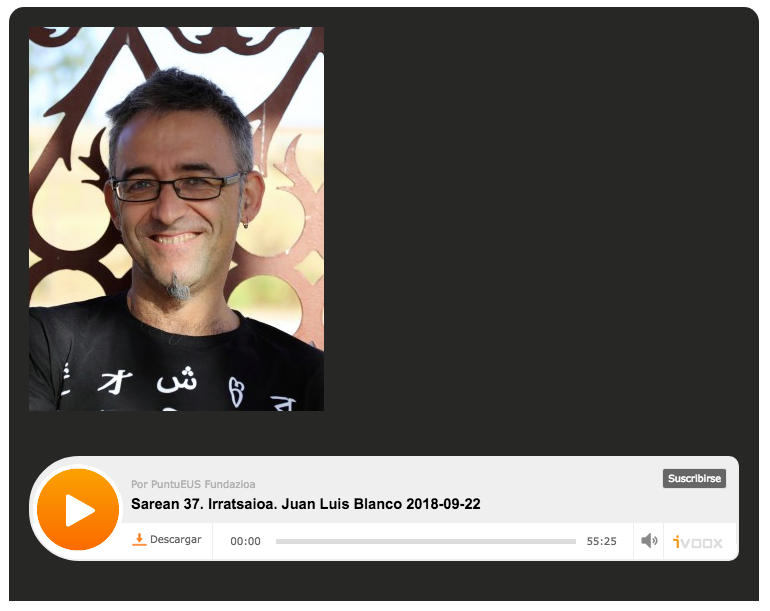
  • Interview in the Basque Radio

    Image of the radio player
    Sarean #37. Calligraphy, Typography and New Technologies were the three main subjects addressed in the interview.

    Few days ago I was interviewed in Sarean, a radio programme of the Basque Radio in collaboration with Sarean.eus association. We talked mainly about Calligraphy and Typography. We also discussed how new technologies make the production of comercial fonts easier, cheaper and faster. We went through the whole type design process, from the first sketches to the tools used for the final production of digital typefaces.

    Glad to see Typography is gaining presence in my near environment. If you are curious and want to know how “type talk” sounds in Basque, clic on the image or follow this link.

  • Lecture on Tifinagh Type Design
    Sustainability and Minority Scripts (Bilbao)

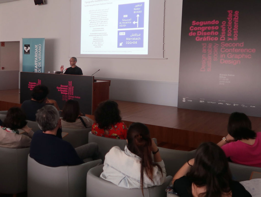
    Type designer Juan Luis Blanco lecturing on Tifinagh and Arabic multi-script signage at the Second Conference in Graphic Design in Bilbao.
    Type Design as an agent for sustainability. I had the privilege to speak on using **multi-script typography** to empower and normalize minority languages and scripts like Tifinagh. Here, I am presenting a tri-script signage example featuring Latin, Arabic, and Tifinagh. Image: E. Herrera.

    The Second Conference in Graphic Design, organized by the University of the Basque Country (UPV/EHU), took place in Bilbao from June 27th to 29th, 2018. Under the theme “Design and Sustainable Society,” I was invited to present a lecture on Tifinagh type design, exploring the unique typographic challenges and opportunities of this North African script.

    The conference explored the intersection of graphic design and sustainability through lenses such as gender, accessibility, and environmental impact. It provided the perfect forum to discuss how type design can help normalize minority languages and scripts in multicultural spaces. Specifically, I focused on giving a contemporary voice to Tifinagh—a script that has been historically marginalized despite its deep roots in North African heritage.

    It was a rewarding experience to introduce this ancient writing system to Basque and Spanish designers and students, many of whom were encountering it for the first time. During the talk, I highlighted recent milestones in multi-script typography, ranging from academic works like my own Amaikha and Redouan Chetouan’s Awal, to the ambitious Typographic Matchmaking in the Maghrib—a collective project in which I was honored to participate as a type designer.

    The latter project resulted in three award-winning families—Elixir, Qandus, and Tubqal—which represent a major leap forward for Amazigh culture and Tifinagh accessibility. I would like to thank the conference organizers for allowing me to share the story of this fascinating script and its role in a more inclusive, sustainable design future.

  • Tifinagh type design workshop at the ÉSAV (Marrakech)

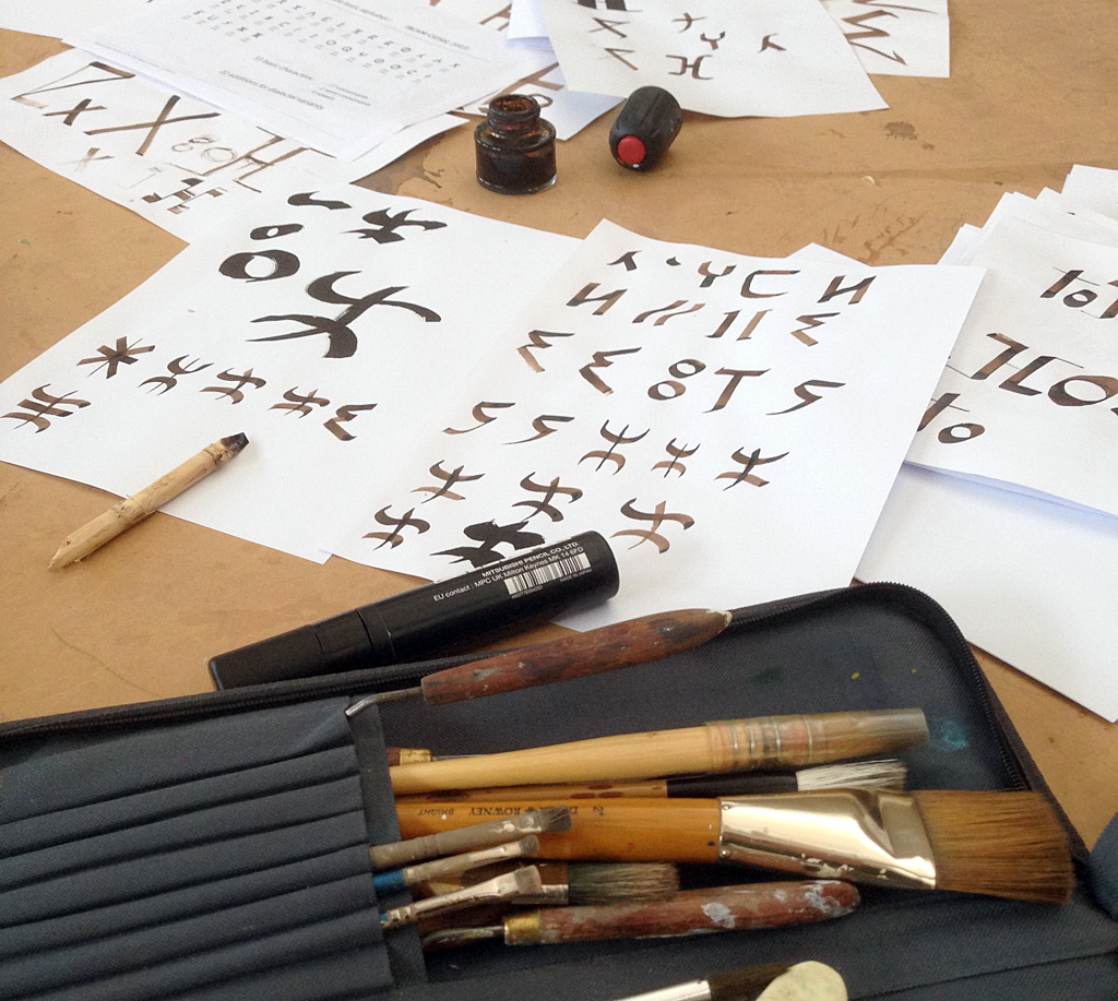
    Tifinagh workshop: trying different tools
    Before we start drawing in the computer it is worth experimenting with different analog tools to see how they affect letter forms.

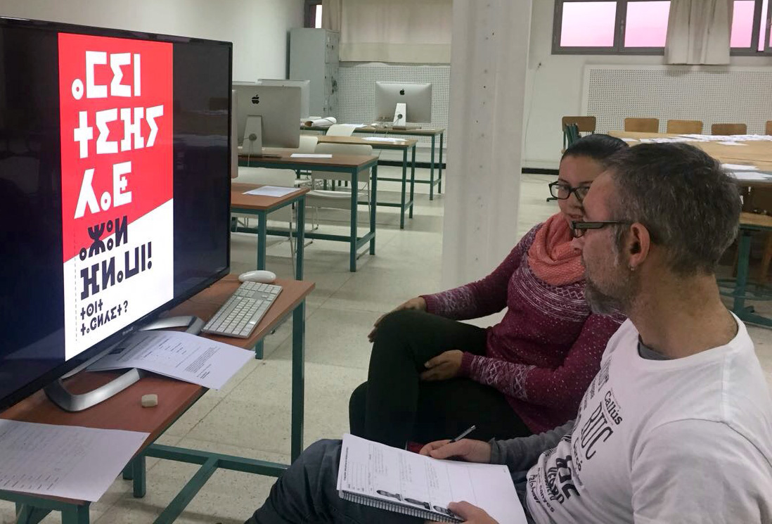
    2018 started with a stimulating commission: I was invited to give a workshop on Tifinagh type design at the École Supérieure des Arts Visuels (ÉSAV) in Marrakech.

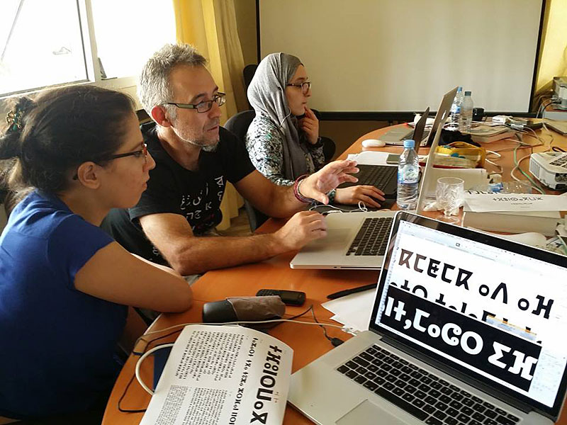
    15 students of the Master’s of Graphic Design took part in an intense one-week workshop. The goal was to make them familiar with the general principles of type design and to illustrate how those apply to the design of the specific letter forms of Tifinagh. We also looked into the history of the alphabet, tried different tools to experiment how they affect the shapes of its letters, got acquainted with specific features of Glyphs app concerning Tifinagh, and learned about its standardization and encoding.

    Tifinagh workshop: explaining spacing and kerning
    Spacing is always a crucial step in type design. Also in the Tifinagh alphabet.

    With all that information students developed diverse projects complying with very specific briefs. All in one week! I want to congratulate the students for their effort and results, and thank Maha Moudine for her invaluable help as assistant lecturer.

    Tifinagh workshop: reviewing the projects
    Maha and myself reviewing the projects
  • ATypI Warsaw 2016:
    A Typographic Maghribi Trialogue lecture

    Juan Luis Blanco, Laura Meseguer, and Kristyan Sarkis presenting the Maghribi Trialogue at ATypI 2016 Warsaw.
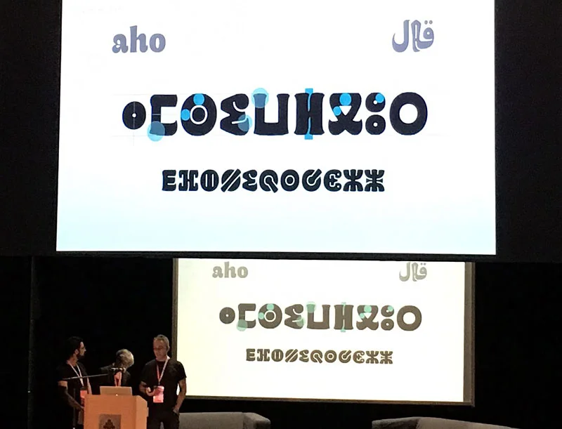
    Presenting the “A Typographic Maghribi Trialogue” lecture at ATypI Warsaw 2016. A deep dive into the research and design of tri-script font families for the Khatt Foundation. Image: Mariko Takagi.

    Few days after our presentation in Amsterdam, Kristyan Sarkis, Laura Meseguer, and myself arrived at the ATypI conference in Warsaw to discuss our experience designing Qandus. This was one of the multi-script type families developed during the Typographic Matchmaking in the Maghrib project. We titled our talk “A Typographic Maghribi Trialogue” to underline the intense and continuous exchange between three distinct writing traditions—Arabic, Latin, and Tifinagh. The project called for a deep respect for each script’s peculiarities while seeking a unified typographic harmony. In my view, our work perfectly matched the conference theme: convergence.

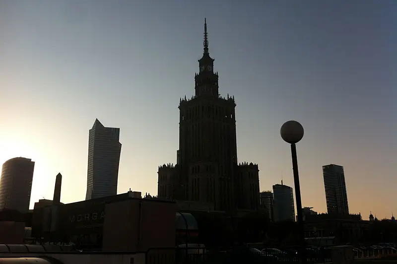
    Skyline of Warsaw
    Tradition and modernity converge in the beautiful skyline of Warsaw.

    Perhaps it was because few people were familiar with the astonishing work of the Moroccan calligrapher Al-Qandusi—the core concept upon which the project is based. Or perhaps it was because many attendees were encountering the Tifinagh alphabet for the first time, or seeing the Latin alphabet “speak” with an Andalusian Berber soul! Whatever the reason, the lecture was highly acclaimed. Here is a glimpse of the feedback we received:

    “…the family includes Latin, Maghribi and Tifinagh. It is a very lively design, which is planned to be developed in a variety of weights (so you may want to keep an eye out for it). The collaborative process between these three talented designers seems to have been such a fruitful experience, their presentation was heartwarming to watch.” Alice Savoie in Alphabettes

    “Laura Meseguer, Kristyan Sarkis and Juan Luis Blanco’s talk about the Typographic Matchmaking in the Maghreb was definitely a peak moment. For me it was a unique presentation, a magical moment. The project consisted of designing a typographic family with the three main writing systems of Maghreb and Al-Andalus: Latin, Arabic and Tifinagh. The result is Qandus, a type family that conveys a historical approach and respect but without the dust of nostalgia.” Elena Veguillas in Alphabettes

    It seems we created high expectations, which encourages us to continue collaborating to extend the Qandus project beyond the three initial weights. The final multi-script family will comprise nine styles across three weights, with each style showcasing specific technical features. These range from solid to fluid constructions on one hand, to the distinction between written and drawn procedures on the other. Those who attended ATypI 2016 in Warsaw already caught a glimpse of the complexity involved in achieving this level of typographic harmony. I hope to share the final results soon; as Alice said, keep an eye out for it!

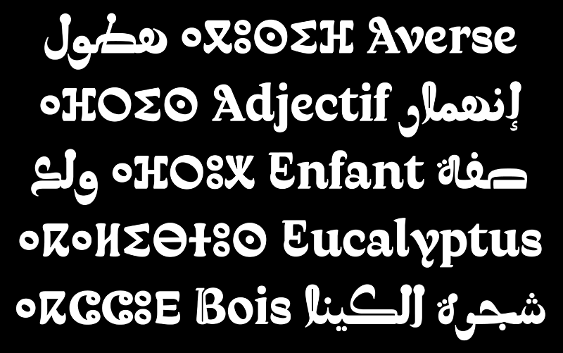
    Comparison slide of Latin, Arabic, and Tifinagh characters showing typographic harmonization from the Qandus project.
    Exploring the structural dialogue between Latin, Arabic, and Tifinagh scripts. Our focus was on creating a balanced rhythm across three distinct writing systems.
  • Tifinagh typography workshop at the IRCAM (Rabat)

    Workshop by JL Blanco and B. Boucheikha at the IRCAM (Rabat) in July 2016
    It is a pleasure to help such hard-working students. Image: Brahim Boucheikha.

    It was a delightful feeling to go back to the IRCAM (The Royal Institute for the Amazigh Culture) to give this workshop about Tifinagh type design with Brahim Boucheikha. I still remember my research trip to Morocco in 2014, when I was working on my dissertation, and how I was welcomed and helped at the IRCAM. This time, I was really pleased to give back my knowledge about typography to five enthusiastic Moroccan students.

    The workshop took place from July 18th to 22nd. After an intense week we were able to present a bunch of new projects that will certainly enrich the typographic scene of the Tifinagh when they are eventually completed. The projects aim to cover different needs according to the briefs they choose. This year the approach was clearly more functional than the previous workshop, which put the focus on expressiveness.

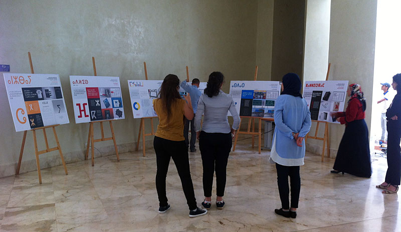
    Exhibition of the Tifinagh typefaces at the IRCAM
    Exhibition of the projects developed during the workshop

    I want to take this opportunity to thank the IRCAM for all their help in my research, and specially for their commitment to the development of Tifinagh type design as a tool for the promotion of this peculiar alphabet and the culture it belongs to. I also want to congratulate the students: Chaymae Ejjakhch, Maha Mouidine, Meriem Mghazli, Issam Battoum and Jawad Ait Hammou, thank you for your dedication and hard work.