Typography & Lettering

Tag: Graphic design

  • Blancoletters in the exhibition
    “50 years, 50 designers”

    The exhibition “50 years, 50 designers” commemorates half a century of the Faculty of Fine Arts. It showcases a selection of 50 works made by professional designers who studied in that faculty. The inauguration, held on 25 March, was a nice meeting between former students and lecturers of the faculty. The press conference highlighted the high level of graphic design in the Basque Country and the unquestionable social role of design in improving our lives and our environment.

    Entre esos trabajos seleccionados se encuentra la familia tipográfica Harri, en sus versiones Display y Text. Es uno de los tres proyectos tipográficos presentes en la exposición, y el único que muestra  un proyecto en torno a la tipografía vasca. Ha sido un gran honor y una gran motivación para seguir trabajando el ser seleccionado para formar parte de esta exposición, que se hará itinerante y que va acompañada de la publicación de un libro que recoge todos los proyectos además de las impresiones y explicaciones de sus creadores.

    Harri type family is among the selected works, both in its Display and Text versions. It is one of the three typographic projects in the exhibition, and the only one that shows a project based on Basque lettering. Being selected for this exhibition has been a great honour and gives me great encouragement to keep on working in the field of type design. It will become a travelling exhibition and soon all the projects along with impressions and explanations from their authors will be collected in a book.

    Below you can see part of the interview the Basque public tv channel (ETB) did to some of the selected designers.
  • Lecture on Tifinagh Type Design
    Sustainability and Minority Scripts (Bilbao)

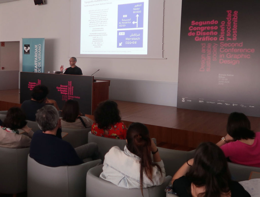
    Type designer Juan Luis Blanco lecturing on Tifinagh and Arabic multi-script signage at the Second Conference in Graphic Design in Bilbao.
    Type Design as an agent for sustainability. I had the privilege to speak on using **multi-script typography** to empower and normalize minority languages and scripts like Tifinagh. Here, I am presenting a tri-script signage example featuring Latin, Arabic, and Tifinagh. Image: E. Herrera.

    The Second Conference in Graphic Design, organized by the University of the Basque Country (UPV/EHU), took place in Bilbao from June 27th to 29th, 2018. Under the theme “Design and Sustainable Society,” I was invited to present a lecture on Tifinagh type design, exploring the unique typographic challenges and opportunities of this North African script.

    The conference explored the intersection of graphic design and sustainability through lenses such as gender, accessibility, and environmental impact. It provided the perfect forum to discuss how type design can help normalize minority languages and scripts in multicultural spaces. Specifically, I focused on giving a contemporary voice to Tifinagh—a script that has been historically marginalized despite its deep roots in North African heritage.

    It was a rewarding experience to introduce this ancient writing system to Basque and Spanish designers and students, many of whom were encountering it for the first time. During the talk, I highlighted recent milestones in multi-script typography, ranging from academic works like my own Amaikha and Redouan Chetouan’s Awal, to the ambitious Typographic Matchmaking in the Maghrib—a collective project in which I was honored to participate as a type designer.

    The latter project resulted in three award-winning families—Elixir, Qandus, and Tubqal—which represent a major leap forward for Amazigh culture and Tifinagh accessibility. I would like to thank the conference organizers for allowing me to share the story of this fascinating script and its role in a more inclusive, sustainable design future.