Typography & Lettering

Tag: Multi-script

  • Lecture on Tifinagh Type Design
    Sustainability and Minority Scripts (Bilbao)

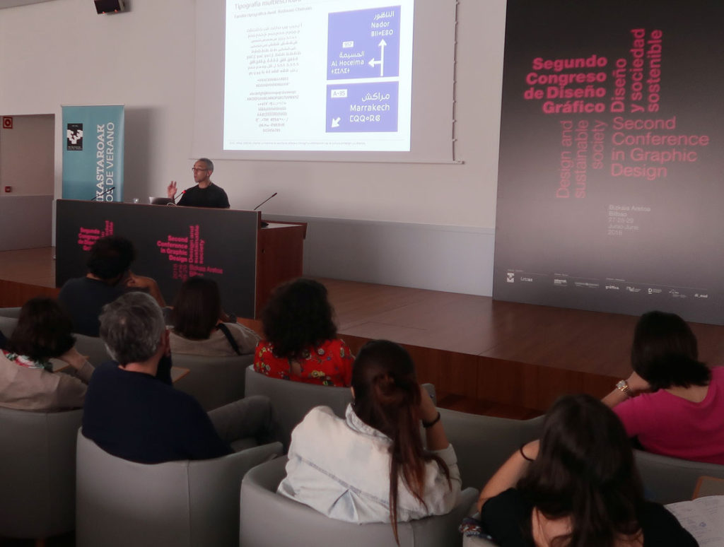
    Type designer Juan Luis Blanco lecturing on Tifinagh and Arabic multi-script signage at the Second Conference in Graphic Design in Bilbao.
    Type Design as an agent for sustainability. I had the privilege to speak on using **multi-script typography** to empower and normalize minority languages and scripts like Tifinagh. Here, I am presenting a tri-script signage example featuring Latin, Arabic, and Tifinagh. Image: E. Herrera.

    The Second Conference in Graphic Design, organized by the University of the Basque Country (UPV/EHU), took place in Bilbao from June 27th to 29th, 2018. Under the theme “Design and Sustainable Society,” I was invited to present a lecture on Tifinagh type design, exploring the unique typographic challenges and opportunities of this North African script.

    The conference explored the intersection of graphic design and sustainability through lenses such as gender, accessibility, and environmental impact. It provided the perfect forum to discuss how type design can help normalize minority languages and scripts in multicultural spaces. Specifically, I focused on giving a contemporary voice to Tifinagh—a script that has been historically marginalized despite its deep roots in North African heritage.

    It was a rewarding experience to introduce this ancient writing system to Basque and Spanish designers and students, many of whom were encountering it for the first time. During the talk, I highlighted recent milestones in multi-script typography, ranging from academic works like my own Amaikha and Redouan Chetouan’s Awal, to the ambitious Typographic Matchmaking in the Maghrib—a collective project in which I was honored to participate as a type designer.

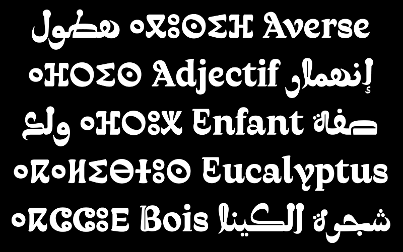
    The latter project resulted in three award-winning families—Elixir, Qandus, and Tubqal—which represent a major leap forward for Amazigh culture and Tifinagh accessibility. I would like to thank the conference organizers for allowing me to share the story of this fascinating script and its role in a more inclusive, sustainable design future.
  • ATypI Warsaw 2016:
    A Typographic Maghribi Trialogue lecture

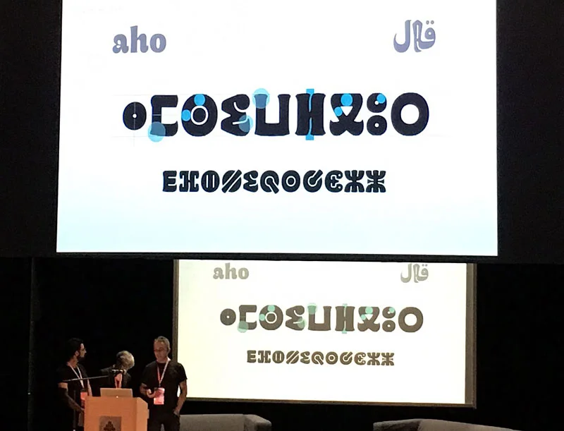
    Juan Luis Blanco, Laura Meseguer, and Kristyan Sarkis presenting the Maghribi Trialogue at ATypI 2016 Warsaw.
    Presenting the “A Typographic Maghribi Trialogue” lecture at ATypI Warsaw 2016. A deep dive into the research and design of tri-script font families for the Khatt Foundation. Image: Mariko Takagi.

    Few days after our presentation in Amsterdam, Kristyan Sarkis, Laura Meseguer, and myself arrived at the ATypI conference in Warsaw to discuss our experience designing Qandus. This was one of the multi-script type families developed during the Typographic Matchmaking in the Maghrib project. We titled our talk “A Typographic Maghribi Trialogue” to underline the intense and continuous exchange between three distinct writing traditions—Arabic, Latin, and Tifinagh. The project called for a deep respect for each script’s peculiarities while seeking a unified typographic harmony. In my view, our work perfectly matched the conference theme: convergence.

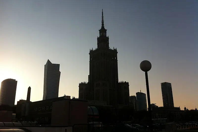
    Skyline of Warsaw
    Tradition and modernity converge in the beautiful skyline of Warsaw.

    Perhaps it was because few people were familiar with the astonishing work of the Moroccan calligrapher Al-Qandusi—the core concept upon which the project is based. Or perhaps it was because many attendees were encountering the Tifinagh alphabet for the first time, or seeing the Latin alphabet “speak” with an Andalusian Berber soul! Whatever the reason, the lecture was highly acclaimed. Here is a glimpse of the feedback we received:

    “…the family includes Latin, Maghribi and Tifinagh. It is a very lively design, which is planned to be developed in a variety of weights (so you may want to keep an eye out for it). The collaborative process between these three talented designers seems to have been such a fruitful experience, their presentation was heartwarming to watch.” Alice Savoie in Alphabettes

    “Laura Meseguer, Kristyan Sarkis and Juan Luis Blanco’s talk about the Typographic Matchmaking in the Maghreb was definitely a peak moment. For me it was a unique presentation, a magical moment. The project consisted of designing a typographic family with the three main writing systems of Maghreb and Al-Andalus: Latin, Arabic and Tifinagh. The result is Qandus, a type family that conveys a historical approach and respect but without the dust of nostalgia.” Elena Veguillas in Alphabettes

    It seems we created high expectations, which encourages us to continue collaborating to extend the Qandus project beyond the three initial weights. The final multi-script family will comprise nine styles across three weights, with each style showcasing specific technical features. These range from solid to fluid constructions on one hand, to the distinction between written and drawn procedures on the other. Those who attended ATypI 2016 in Warsaw already caught a glimpse of the complexity involved in achieving this level of typographic harmony. I hope to share the final results soon; as Alice said, keep an eye out for it!

    Comparison slide of Latin, Arabic, and Tifinagh characters showing typographic harmonization from the Qandus project.
    Exploring the structural dialogue between Latin, Arabic, and Tifinagh scripts. Our focus was on creating a balanced rhythm across three distinct writing systems.