Typography & Lettering

Tag: Latin

  • ATypI Warsaw 2016:
    A Typographic Maghribi Trialogue lecture

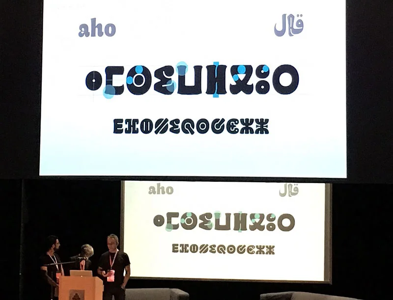
    Juan Luis Blanco, Laura Meseguer, and Kristyan Sarkis presenting the Maghribi Trialogue at ATypI 2016 Warsaw.
    Presenting the “A Typographic Maghribi Trialogue” lecture at ATypI Warsaw 2016. A deep dive into the research and design of tri-script font families for the Khatt Foundation. Image: Mariko Takagi.

    Few days after our presentation in Amsterdam, Kristyan Sarkis, Laura Meseguer, and myself arrived at the ATypI conference in Warsaw to discuss our experience designing Qandus. This was one of the multi-script type families developed during the Typographic Matchmaking in the Maghrib project. We titled our talk “A Typographic Maghribi Trialogue” to underline the intense and continuous exchange between three distinct writing traditions—Arabic, Latin, and Tifinagh. The project called for a deep respect for each script’s peculiarities while seeking a unified typographic harmony. In my view, our work perfectly matched the conference theme: convergence.
    Skyline of Warsaw
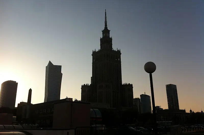
    Tradition and modernity converge in the beautiful skyline of Warsaw.

    Perhaps it was because few people were familiar with the astonishing work of the Moroccan calligrapher Al-Qandusi—the core concept upon which the project is based. Or perhaps it was because many attendees were encountering the Tifinagh alphabet for the first time, or seeing the Latin alphabet “speak” with an Andalusian Berber soul! Whatever the reason, the lecture was highly acclaimed. Here is a glimpse of the feedback we received:

    “…the family includes Latin, Maghribi and Tifinagh. It is a very lively design, which is planned to be developed in a variety of weights (so you may want to keep an eye out for it). The collaborative process between these three talented designers seems to have been such a fruitful experience, their presentation was heartwarming to watch.” Alice Savoie in Alphabettes

    “Laura Meseguer, Kristyan Sarkis and Juan Luis Blanco’s talk about the Typographic Matchmaking in the Maghreb was definitely a peak moment. For me it was a unique presentation, a magical moment. The project consisted of designing a typographic family with the three main writing systems of Maghreb and Al-Andalus: Latin, Arabic and Tifinagh. The result is Qandus, a type family that conveys a historical approach and respect but without the dust of nostalgia.” Elena Veguillas in Alphabettes

    It seems we created high expectations, which encourages us to continue collaborating to extend the Qandus project beyond the three initial weights. The final multi-script family will comprise nine styles across three weights, with each style showcasing specific technical features. These range from solid to fluid constructions on one hand, to the distinction between written and drawn procedures on the other. Those who attended ATypI 2016 in Warsaw already caught a glimpse of the complexity involved in achieving this level of typographic harmony. I hope to share the final results soon; as Alice said, keep an eye out for it!
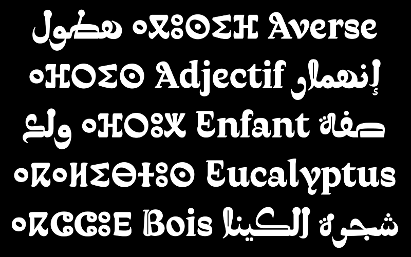
    Comparison slide of Latin, Arabic, and Tifinagh characters showing typographic harmonization from the Qandus project.
    Exploring the structural dialogue between Latin, Arabic, and Tifinagh scripts. Our focus was on creating a balanced rhythm across three distinct writing systems.
  • Typographic Matchmaking in the Maghrib IV (Amsterdam)

    Feedback session with all the teams of the Typographic Matchmaking in the Maghrib project

    Amsterdam was our last stage in the Typographic Matchmaking in the Maghrib project. Four intense days were the final sprint that eventually resulted in the presentation of the whole project in the FramerFramed space on the 10th of September. It was a time for fine tuning, giving and taking feedback from every member of the teams and also to exchange our ideas about our work, research and design processes. The images below show some instances of the three typefaces in use. Qandus, Tubqal and Elixir have diverse personalities and each one solves the issue of harmonizing the three scripts –Latin, Arabic and Tifinagh— in a distinctive way. I was lucky enough to be part of two teams –Tubqal and Qandus—, so I had the chance to be involved in two projects with different approaches, goals and working procedures, which made the experience a bit busy at times, but definitely much more enriching.

    Poster for presentation of TMM3 project in Amsterdam set in Tubqal, Qandus and Elixir

    The final typefaces will be delivered soon, so stay tuned for the release of the book and the fonts in 2017. The Typographic Matchmaking in the Maghrib has been a wonderful opportunity to meet amazing poeple. I want to take the opportunity to express all my gratitude to every member of this fantastic crew, starting from Huda Smitshuijze AbiFares
 (Curator), Brahim Boucheikha (Assistant Curator), Jan de Bruin (Film maker) and Laura Meseguer, Kristyan Sarkis, Andreu Balius, Salah Bellizi, Naïma Ben Ayed and Redouan Chetuan (Designers). You all have made this year one of the best professional and personal experiences of my life. So let me tell you one last thing in different languages and typefaces:

    bedankt, tanmirt, merci, thank you, gracias set in Tubqal, Qandus and Elixir

    Eskerrik asko bihotz bihotzetik!


    See also:

    Typographic Matchmaking in the Maghrib (Marrakech)

    Typographic Matchmaking in the Maghrib II (Granada-Córdoba)

    Typographic Matchmaking in the Maghrib III (Montalba-le-Château)

    Typographic Matchmaking in the Maghrib IV (Amsterdam)

  • Typographic Matchmaking in the Maghrib III
    (Montalba-le-Château)

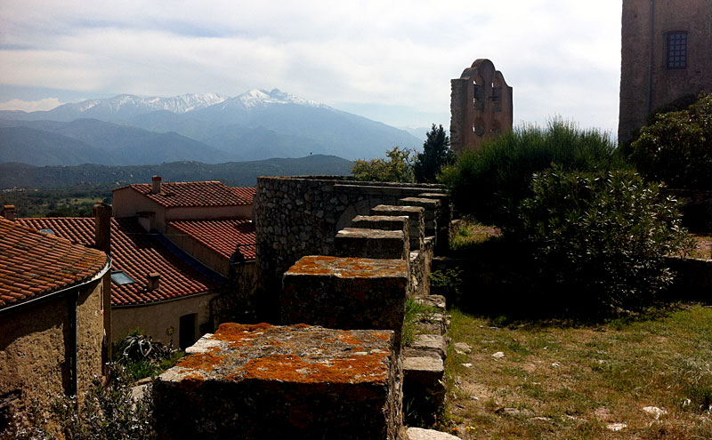
    Wonderful landscape in Montalba-le-Château

    Montalba-le-Château welcomed us with a warm and sunny weather. The castle looked like the right place to isolate ourselves from any distraction and to focus in our porjects. This has been probably the most intense and productive of our workshops. Four days of hard work resulted in the consolidation of the three projects, which was the main goal of this meeting. There is still a lot of work ahead but the main guidelines of our projects are already set. Qandus, Tubqal and Al-Zahra, the three type families, have completely different approaches and are devised for different purposes. Qandus is a display font based in the work of the Moroccan calligrapher Al-Qandusi. Tubqal is a rational sans for long texts based on the mabsut variant of the Maghribi style of calligraphy. Al-Zahra is the most experimental and will play with the horizontal vs. vertical stress angles that make Latin and Arabic calligraphy so different.

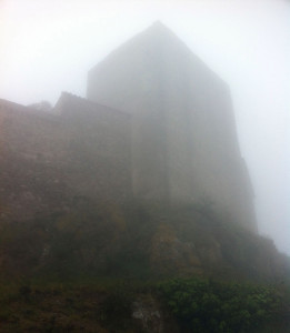
    The castle of Montalba-le-Château in the fog

    Montalba said goodbye in a smoggy, opaque and mysterious atmosphere. What these three diverse projects will look like in our next workshop in Amsterdam remains also a mystery. We will have to wait to reveal it.

    See also:

    Typographic Matchmaking in the Maghrib (Marrakech)

    Typographic Matchmaking in the Maghrib II (Granada-Córdoba)

    Typographic Matchmaking in the Maghrib III (Montalba-le-Château)

    Typographic Matchmaking in the Maghrib IV (Amsterdam)

  • Typographic Matchmaking in the Maghrib II
    (Granada-Córdoba)

    Decorative calligraphy at the Alhambra, Granada
    Exquisite arabic calligraphy in the Alhambra. Just a tiny sample of the wonders one can find there.

    I think it is high time I updated the information about this wonderful and inspiring typographic experience. Since our first workshop in Marrakech last September, we have met two more times in Granada/Córdoba –in December— and recently in Montalba-le-Château, France. Our work in Granada and Cordoba was still rather exploratory. The main guidelines seemed to be defined but there was still the challenge of translating the findings and proposals of each alphabet into the the others while keeping each one’s specificity.

    During this second workshop we spent a whole day visiting La Alhambra. With the help of renown professor of Islamic art José Miguel Puerta Vílchez we were absolutely delighted to discover the stunning omnipresence and integration of calligraphy and lettering in the architecture: words were everywhere building texts, textures and walls! Three more remarkable visits completed our field work: the spectacular Mosque of Cordoba, the archaeological site of Madinat al-Zahra and the Cordoba Archeological Museum.

    Superposition of arabic and renaissance styles at the Cathedral of Cordoba
    Coexistence? Superposition? Imposition? This is when you realize things were far from ideal in Cordoba at a time.

    Al-andalus was clearly a must in this project. Its historical cultural mix of Arab Maghribi, Morisco and Spanish cultures inspired and influenced our work in different ways. It was also an opportunity to think about the ideal of cultural coexistence. The palace of Charles V built inside the Alhambra, or the cathedral erected in the middle of the mosque in Cordoba did not seem the best examples of respectful coexistence and harmony. Food for thought for our projects…

    The workshop ended with the presentation of the projects in Casa Árabe. My sincere gratitude to its stuff for their kind support. More about our third workshop in the next post (coming soon hopefully).

    See also:

    Typographic Matchmaking in the Maghrib (Marrakech)

    Typographic Matchmaking in the Maghrib II (Granada-Córdoba)

    Typographic Matchmaking in the Maghrib III (Montalba-le-Château)

    Typographic Matchmaking in the Maghrib IV (Amsterdam)

  • Typographic Matchmaking in the Maghrib
    (Marrakech)

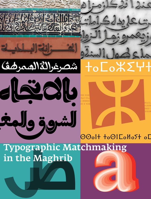
    Typographic Matchmaking in the Maghrib poster
    Poster of the TMM3 project displaying Amaikha Tifinagh, among other typefaces.

    I am glad to start the News section with this project. During one year a group of European (Dutch, Spanish, French) and Arab (Lebanese, Moroccan, Tunisian) designers will research and develop tri-script font families that combine Arabic, Tifinagh and Latin scripts harmoniously. Both the Maghribi and the Tifinagh scripts have not been fully explored in contemporary digital fonts, though they harbor a wealth of aesthetic variety and expressive potential.

    I am really honoured to work with such talented type designers as Laura Meseguer, Kristyan Sarkis, Naïma Ben Ayed, Redouan Chetuan, Salah Bellizi and Andreu Balius. The first workshop took place in Marrakech, from 12th to 19th September 2015. Following three busy days of introductions, presentations, meetings with experts and calligraphers, visits to the IRCAM (Institute Royale de la Culture Amazigh) and the manuscript collection of the National Library of Morocco and, of course, fieldwork and research in the medina and the souk, we had two intense working sessions at the École Supérieure des Arts Visuels de Marrakech (ESAVM).

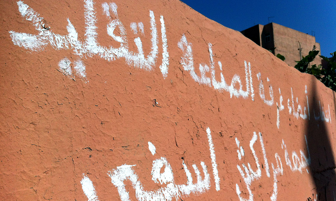
    Arabic handwriting on wall
    Arabic handwriting on wall in our way to the Majorelle Garden and the Berber Museum

    The three teams defined their initial ideas and sketches for the tri-script families. They are diverse in conception but equally interesting and challenging. We will see how they evolve in the next months and how the Tifinagh script, for which I am an advisor in two of the teams, matches the Latin script and the peculiar Maghribi style. Next stage will take place in November in Granada and Córdoba (Spain). I want to thank the Khatt Foundation for giving me the opportunity to work in this project.

    See also:

    Typographic Matchmaking in the Maghrib (Marrakech)

    Typographic Matchmaking in the Maghrib II (Granada-Córdoba)

    Typographic Matchmaking in the Maghrib III (Montalba-le-Château)

    Typographic Matchmaking in the Maghrib IV (Amsterdam)