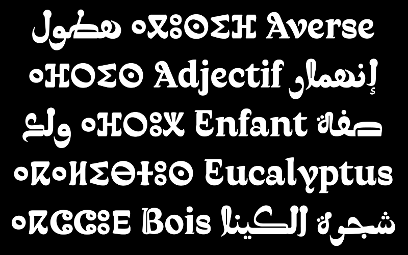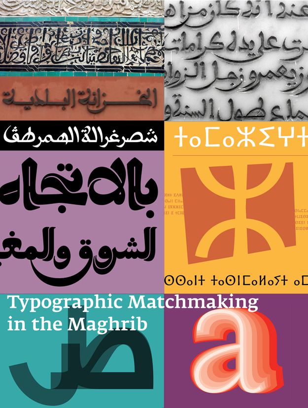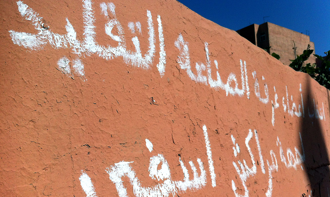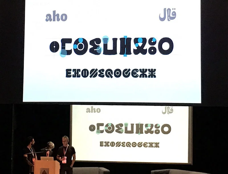
Few days after our presentation in Amsterdam, Kristyan Sarkis, Laura Meseguer, and myself arrived at the ATypI conference in Warsaw to discuss our experience designing Qandus. This was one of the multi-script type families developed during the Typographic Matchmaking in the Maghrib project. We titled our talk “A Typographic Maghribi Trialogue” to underline the intense and continuous exchange between three distinct writing traditions—Arabic, Latin, and Tifinagh. The project called for a deep respect for each script’s peculiarities while seeking a unified typographic harmony. In my view, our work perfectly matched the conference theme: convergence.
Perhaps it was because few people were familiar with the astonishing work of the Moroccan calligrapher Al-Qandusi—the core concept upon which the project is based. Or perhaps it was because many attendees were encountering the Tifinagh alphabet for the first time, or seeing the Latin alphabet “speak” with an Andalusian Berber soul! Whatever the reason, the lecture was highly acclaimed. Here is a glimpse of the feedback we received:
“…the family includes Latin, Maghribi and Tifinagh. It is a very lively design, which is planned to be developed in a variety of weights (so you may want to keep an eye out for it). The collaborative process between these three talented designers seems to have been such a fruitful experience, their presentation was heartwarming to watch.” in Alphabettes
“Laura Meseguer, Kristyan Sarkis and Juan Luis Blanco’s talk about the Typographic Matchmaking in the Maghreb was definitely a peak moment. For me it was a unique presentation, a magical moment. The project consisted of designing a typographic family with the three main writing systems of Maghreb and Al-Andalus: Latin, Arabic and Tifinagh. The result is Qandus, a type family that conveys a historical approach and respect but without the dust of nostalgia.” in Alphabettes
It seems we created high expectations, which encourages us to continue collaborating to extend the Qandus project beyond the three initial weights. The final multi-script family will comprise nine styles across three weights, with each style showcasing specific technical features. These range from solid to fluid constructions on one hand, to the distinction between written and drawn procedures on the other. Those who attended ATypI 2016 in Warsaw already caught a glimpse of the complexity involved in achieving this level of typographic harmony. I hope to share the final results soon; as Alice said, keep an eye out for it!