Akaya is now part of Google Fonts catalog. It has been a long way since we started the project in 2015, but it is now available under the Open Font License.
In its website (https://fonts.google.com/specimen/Akaya) you will be able to type your own text in different sizes and check how it looks in Akaya as well as to try combinations and pairings with other fonts in the same catalogue. Enjoy!
Euskal Herriko paisaia bisualean bada zerbait oharkabean pasatzen ez dena, baita ezagutza tipografikorik ez dutenentzat ere: lurralde osoan zehar sakabanatutako kale plaka, seinale, kartel eta letreroetan dagoen errotulazio estilo berezia. Hizkera grafiko hau, euskal grafia tradizionalari hertsiki lotua eta Harri tipografiaren inspirazio-iturri izan dena, forma oso astunak, trazu konkaboak eta diseinu glifiko exageratua ditu ezaugarri, erpin zorrotzak eta letra egitura ez oso konbentzionalak sortzen dituena. Itxura trinko hori, ia harrizkoa, herri-errotulazioari, inskripzio harritsuei eta arkitektura tradizionalari dagokie. Horrek azaltzen du tradizioaren, benetakotasunaren eta euskal izaeraren ideiekin duen lotura, eta diseinu grafikoaren esparruan duen berrirakurketa garaikidea, sorkuntza tipografiko digitaleko tresnei esker.
Harri tipografiaren sorrera
Harri tipografia bezero baten enkargu bitxi baten ondorioz jaio zen, behintzat kontzeptualki. Haren eskaera zera izan zen: “gure logoa euskal munduarekin lotura garbia izatea nahi dugu, baina harategietan eta sagardotegietan erabiltzen den euskal tipografia hori erabili gabe” – euskal grafiaren estiloari erreferentzia eginez!
Euskal letra forma ohikoenetakoak Getariko arrandegi baten letreroan. Iturria: Juan Luis Blanco
Irudi dotoreago bat behar zuten, eta haien premia beteko luken tipografia bat eskuratzea ezinezkoa izango zela konturatu nintzen. Ez zen existitzen. Hutsune horretaz konturatzean zerbait egin behar zela erabaki nuen. Zenbait urte geroago Harri tipografia, euskal tipografia “gaingabetua” bezala definitu nuen, ohiko letra lodi eta potoloen formekin kontraste ikaragarria egingo luken alfabeto fin eta dotorea izan zelako haren abiapuntua. Proiektuan bariante lodi horiek gehitu nituen ere bai, noski, haiek izan baitziren diseinu erizpide nagusiak zein detaileentzako inspirazioaren iturria: euskal kutsua eransteko ezinbesteko osagaiak.
Harri tipografiak bost aldaera ditu. Irudian Harri Light eta Harri Extrabold. Iturria: Juan Luis Blanco.
Euskal grafiaren jatorria
Harri tipografiaren proiektua eta diseinua Euskal Herrian egin ziren. Eta herrialde honetako jendea definitzen duen zerbait badago —bere ideia politikoak edozein direla ere— nazionalismoari buruzko eztabaida sutsuak dira. Ondorioz, zaila da euskal kulturarekin zerikusia duen edozein gai jorratzea, nazionalisten eta ez-nazionalisten arteko eztabaidan edo, zehatzago esanda, nireNazionalismoaren eta zureNazionalismoaren arteko eztabaidan erori gabe. Jakina, euskal tipografiaren jatorriari buruz hitz egiten dugunean —edo, zehatzago esanda, euskal errotulazioaren estiloari buruz—, oso ohikoa da kontrajarriak diren jarrera horiekin topo egitea. Horrela, badira estilo hau Euskal Herriko bertako fenomeno originaltzat hartzen dutenak alde batetik. Baita XX. mendeko lehen hamarkadetan gorakada izan zuen euskal nazionalismoaren asmakizuntzat hartzen dutenak ere, eta beraz, ezin dela euskal tradiziotzat hartu.
Nire iritsiz osatugabeak dira bi interpretazioak, baina modu bitxian osatzen dute elkar. Bistan da mugimendu nazionalistek irudi sistema bat erabili eta sustatu zutela, XX. mendearen hasierako euskal gizartean nabarmentasuna eta presentzia indartzeko, eta tipografia, alde horretatik, ahalmen ukaezina duen tresna bat da. Baina zaila da sinestea erakunde nazionalista bateko propaganda-arduradunaren asmakizun hutsa izan zela. Inspirazio-iturri argiak daude, eta hainbat adituk zalantzik gabe aipatu dituzte euskal nazionalismoari buruz dituzten ideiak edozein direla ere. Iturri horiek Ipar Euskal Herrian eta Nafarroako iparraldeko eremu batzuetan dauden hilarri eta ateburuko inskripzio zaharrak dira. Inskripzio horiek —batzuk XVII. mendekoak— Europa osoan zehar nonahi zeuden inskripzio garaikideen estilo beretsuarekin daude eginak.
Ezpeletako elizaren atarian gordetako inskripzioa. Euskal letragintzan gerora garatuko diren zenbait ezaugarri ikus daitezke. Iturria: Juan Luis Blanco.
Beraz, zentzuzkoa dirudi ondorioztatzea ez dela guztiz asmakizun berri bat, ezta ere guztiz errotua dagoen euskal tradizio bat. Hori esanda, niri benetan originala eta aipagarria iruditzen zaidana da forma horiek nola eboluzionatu duten jatorri hartatik. Eta are deigarriagoa haien erabilpena nola hedatu den identitate ikurra bezala Euskal Herriko txoko guztietaraino. Euskaldun asko letra-estilo horren bidez identifikatuta sentitzeak, baina, batez ere, urruneko lekuetako pertsonek grafia hori euskal jatorriarekin zalantzik gabe lotzeak eragiten du, praktikan, euskal grafia gisa definitzea. Eta hori ez da gertatu antzeko inskripzioak zeuden beste tokietan.
Harri tipografia behe-erliebean probatzeko ariketa esperimentala. MATD Reading 2013. Iturria: Juan Luis Blanco.
Harrizko letretatik OpenType tipografia digitaletaraino
Antzinako inskripzio horietan goi-erliebean zizelkatutako letretatik hartzen ditu Harrik bere ezaugarri esanguratsuenak. Teknika horretan letren arteko espazioa beheratu behar denez, espazioa aurrezteko konposizio-baliabide interesgarriak sortzen dira (horietako batzuk OpenType programazioaren bidez lortzen dira Harri tipografian). Jakina, gaur egun erabiltzen diren formak kontuan hartzen dira, baina beti antzinako formei eta haien aurrekariei erreparatuta: inskripzio erromanikoak eta, azken batean, maiuskula erromatarrak alegia; horien proportzioek gidatzen baitute Harri tipografiaren oinarrizko alfabetoa. Euskal tipografia fin eta erabilgarria diseinatzea da idea nagusia —nire bezeroaren beharrak ase ahal izango zituen hori—, eta, aldi berean, bere pisu-barianteen bidez haren euskal grafiaren bilakaera bitxia erakustea, inspirazio erromatarreko “light” aldaera dotoretik hasita, pisutsu eta adierazkorra den “Extra Bold” barianteraino, non gaur egungo formen islada nabarmenagoa da. Osagarri gisa, harrizko inskripzio bakoitza paregabea egiten dituen konposizio-baliabide horiek karaktere alternatibo automatizatu gisa erabil daitezke Harrin. Azkenik, Harri tipografiak 4 aldaera estilistiko ditu (“Stylistic sets”), eta, horiei esker, euskal izaera areagotu eta nabarmendu daiteke, ezaugarri bereizgarrienetako batzuk indartuz, edo, bestela, gutxitu daitezke, emaitza erabat neutroagoa lortuz, erabilera orokorragoetan erabil daitekeena.
Harri izena proiektuak oinarritzat hartu duen aintzinako harrizko inskripzioen omenez aukeratu nuen. Harri Text testu luzeentzako diseinaturiko bertsio berria da. Maiuskulak, maiuskula txikiak, minuskulak, italikak (kursibak) eta karaktere-sorta zabalagoa eskeintzen ditu.
Hay algo en el paisaje visual del País Vasco que no pasa desapercibido, incluso para quienes no tienen conocimientos tipográficos: el peculiar estilo de rotulación presente en placas de calles, señales, carteles y letreros repartidos por todo el territorio. Este lenguaje gráfico, estrechamente ligado a la grafía vasca tradicional y que ha servido de inspiración para la tipografía Harri, se caracteriza por sus formas pesadas, trazos rotundos y un diseño glífico exagerado que da lugar a astas cóncavas, vértices afilados y formas de letra poco convencionales. Su aspecto rústico, casi pétreo, remite tanto a la rotulación popular como a las inscripciones lapidarias y a la arquitectura tradicional, lo que explica su asociación con ideas de tradición, autenticidad y carácter vasco y su relectura contemporánea en el ámbito del diseño gráfico gracias a las herramientas de creación tipográfica digital.
El origen de la tipografía Harri
El proyecto de tipografía Harri nació el día en que un cliente me encargó un logo que tenía que mostrar un carácter inequívocamente vasco pero con una condición: evitar “esa tipografía vasca empleada para sidrerías y carnicerías” en clara referencia al estilo de rotulación vasco mencionado.
Uno de las variantes de la grafía vasca más usadas en el letrero de una pescadería en Getaria (País Vasco). Fuente: Juan Luis Blanco
Los antecedentes de la grafía vasca
Era obvio que necesitaban una imagen más refinada, y me dí cuenta de que no existía ninguna tipografía que yo pudiera usar para satisfacer ese requisito. Por tanto, había una necesidad y una buena oportunidad para aportar una solución, de modo que decidí que tenía que hacer algo al respecto. Años más tarde definí Harri como una tipografía “baja en grasa” en alusión a su punto de partida inicial: una versión fina y elegante que iba a contrastar fuertemente con los estilos de letra super gruesos más habituales en ese ámbito. Por supuesto el proyecto final incluye esas versiones negras pues son la inspiración principal tanto para el diseño general como para los detalles de gran parte de los caracteres. El tipo de detalles que iban a revelar su origen inequívocamente vasco.
Tanto la investigación para el proyecto como el diseño de la tipografía Harri fueron realizados en el País Vasco. Y si hay algo que define a la gente de este país, independientemente de sus ideas políticas, son sus encendidos debates sobre el nacionalismo. Como consecuencia, es complicado tratar cualquier tema relacionado con la cultura vasca sin verse envuelto en un debate entre nacionalistas y no-nacionalistas, o dicho de modo más preciso, entre miNacionalismo y tuNacionalismo. Por supuesto, cuando hablamos del origen de la tipografía vasca —o por ser más específico, del estilo de rotulación vasco— es muy común encontrarse con estos posicionamientos en conflicto, habiendo quien lo considera un fenómeno original y autóctono del País Vasco, y quien lo considera una invención de un nacionalismo vasco en auge en las primeras décadas del siglo XX, y por lo tanto nada que sea ni originario ni tradicionalmente vasco.
En mi opinión, ambas interpretaciones pueden considerarse erróneas en cierta medida, lo que curiosamente las hace complementarias. Es obvio que los movimientos nacionalistas utilizaron y fomentaron un sistema visual que les hiciera distinguibles y reforzara su presencia en la sociedad vasca de principios del siglo XX, y la tipografía era una herramienta con un potencial indiscutible en este sentido. Pero es difícil de creer que fuera la invención aislada del responsable de propaganda de una organización nacionalista. Hay claras fuentes de inspiración que han sido señaladas por expertos diferentes independientemente de sus ideas sobre el nacionalismo vasco. Estas fuentes son las antiguas inscripciones sobre lápidas, estelas o dinteles que se pueden encontrar en el País Vasco-Francés y en algunas áreas del norte de Navarra. Estas inscripciones –algunas de ellas datadas en el siglo XVII– muestran a su vez influencias de inscripciones coetáneas, y de otras que se remontan al románico, que se encuentran dispersas por toda Europa.
Lápida conservada en el pórtico de la iglesia de Ezpeleta. Se pueden observar algunas características que se desarrollarán posteriormente en la grafía vasca. Fuente: Juan Luis Blanco
Por tanto parece razonable concluir que no se trata ni de una invención relativamente reciente, ni de una enraizada tradición exclusivamente vasca. Dicho esto, lo que yo encuentro ciertamente notable y original es la manera peculiar en la que esas formas han evolucionado desde aquellos orígenes. Y aún más llamativo resulta cómo su uso como símbolo identitario se ha extendido a todos los rincones del País Vasco. El hecho de que muchos vascos se sientan identificados por este estilo de letra, pero sobre todo, el hecho de que personas de lugares lejanos asocien sin asomo de duda esta grafía con un origen vasco es lo que hace, en la práctica, que podamos definirla como una grafía vasca.
Ejercicio experimental para probar la tipografía Harri en bajorrelieve. MATD Reading 2013. Fuente: Juan Luis Blanco.
De las inscripciones en piedra a la era de las tipografías Opentype
El diseño de esas antiguas inscripciones, cuyas letras son cinceladas en altorrelieve, es de donde Harri toma parte de sus rasgos más significativos. El hecho de que sea el espacio entre las letras lo que ha de ser rebajado da lugar a interesantes recursos compositivos para ahorrar espacio (algunos de los cuales son emulados en Harri mediante programación OpenType). Por supuesto, las formas en uso hoy en dia son tenidas en cuenta pero siempre con la mirada puesta en aquellas formas antiguas y sus antecesoras: las inscripciones románicas y en última instancia las capitales romanas, cuyas proporciones guían la construcción del alfabeto básico en Harri. Como idea central, está la intención de diseñar una tipografía refinada y decididamente vasca —algo que hubiera podido satisfacer las necesidades de mi cliente— y a la vez, tratar de revelar su peculiar evolución a través de sus diferentes pesos, desde la elegante variante Light, de inspiración romana, hasta la pesada y expresiva “Extra Bold”, que se emparenta más directamente con las formas actuales sin perder su sobriedad.
Como complemento, algunos de los recursos compositivos que hacen únicas cada una de las inscripciones en piedra son accesibles en Harri como alternativas contextuales automatizadas. Finalmente, Harri cuenta con 4 grupos de variantes estilísticas (Stylistic sets) que permiten enfatizar su carácter local y vasco reforzando algunos de sus rasgos más identificativos, o bien, prescindir de ellos obteniendo un resultado prácticamente neutro que pude emplearse en usos más generales.
El nombre “Harri”, que significa piedra en euskera, es un pequeño homenaje a sus orígenes. Harri Text es una nueva versión de Harri que incluye mayúsculas, minúsculas, versalitas, itálicas y un juego de caracteres ampliado.
There is something in the visual landscape of the Basque Country that rarely goes unnoticed, even by those with no background in typography: the distinctive lettering style found on street signs, plaques, posters and shop signs throughout the region. Closely linked to traditional Basque lettering and serving as a source of inspiration for the Harri typeface, this graphic language is characterized by extremely heavy forms, bold strokes and an exaggerated glyph design that results in concave stems, sharp vertices and unconventional letter structures. Its rough, almost stone-like appearance recalls both vernacular sign painting and lapidary inscriptions found in traditional architecture, helping to explain its association with ideas of tradition, authenticity and Basque identity, as well as its contemporary reinterpretation through digital type design tools.
The genesis of the Harri typeface
Harri, as a typographic project, began on the day a client asked me to design a logo that would clearly be recognised as Basque. There was one firm restriction: to avoid the ‘Basque typeface’ typically used for cider houses and butcher shops. This was an obvious reference to the aforementioned Basque lettering style.
One of the most widely used variants of Basque lettering on a sign at a fishmonger’s in Getaria (Basque Country). Source: Juan Luis Blanco
They definitely needed a more polished image, and I realised there was nothing I could use to meet their expectations. So there was a need and there was room for innovation, and I decided something had to be done. Years later, I defined Harri as a Basque “low-fat” typeface because it started as a light and refined version that contrasted strongly with the black, almost fat, letter forms typical of this style. The final project includes those black variants because they inspired both the overall design and the details of most of the characters, which show its unmistakable “Basqueness”.
Harri type family is available in five weights. In the image Harri Light & Harri ExtraBold
The roots of the Basque lettering style
The research for the project and the design of Harri was conducted in the Basque Country. A defining characteristic of Basque people is their strong opinions on nationalism, regardless of their political views. As a result, it is almost impossible to talk about any Basque cultural instance without getting trapped in the discourse of nationalism vs. no-nationalism, which, let’s be serious, needs to be rephrased as myNationalism vs. yourNationalism. The origin of the Basque lettering style is also a point of contention. Some believe it is a vernacular style from the Basque Country, while others see it as an invention of nationalist movements in the early 20th century, dismissing it as nothing original or traditionally Basque.
What’s interesting is that, in my view, both views are equally flawed (or at least incomplete), which makes them complementary. It’s clear that nationalist movements fostered a visual system to reinforce their distinctiveness and presence in Basque society during the early 20th century. Typography, or better said, lettering, played a significant role in this endeavour. However, it’s undeniable that it wasn’t solely the invention of a nationalist organisation’s propaganda manager. Scholars, regardless of their stance on Basque nationalism, have pointed out clear sources of inspiration. These sources include ancient inscriptions carved on gravestones found in the French part of the Basque Country (Behe Nafarroa, Lapurdi, and Zuberoa), as well as some areas of the North of Navarra. These inscriptions, some of which date back to the 17th century, show influences from both contemporary and Romanesque inscriptions found throughout Europe.
Tombstone preserved in the portico of the church of Ezpeleta. Some characteristics that would later develop in the Basque lettering style can be observed. Source: Juan Luis Blanco
Therefore, it’s easy to agree that it’s neither a relatively recent invention nor a deeply rooted and exclusively Basque manifestation. What I find original and unique is the way it has evolved from those origins. And the most remarkable fact in my view is how its use has spread all over the Basque Country as an identity conveyor. The fact that Basque people seem to feel identified by this lettering style, and moreover, the fact that people from other places associate those forms with a Basque origin, makes them convincingly Basque.
Experimental exercise testing the Harri typeface in bas-relief. MATD Reading 2013. Source: Juan Luis Blanco.
From carved letters to the era of OpenType fonts
Harri takes part of its significant features from those ancient inscriptions, in which letters are not incised but carved in relief. The fact that the space between letters must be removed results in heavier and less contrasting shapes, and gives rise to a series of interesting composition devices for space-saving (some of which are emulated in Harri using OpenType programming). Of course, the current widely-used shapes derived from them are taken into account but keeping always in sight their predecessors: the Romanesque inscriptions and ultimately the Roman Capitals, which influence their proportions. The central guideline is to create a refined yet distinctly Basque typeface, —something that my client would have been willing to use— and also to echo the peculiar evolution of this style through its weights, ranging from the clean formal Roman-inspired light to the extreme expressive Basque-style extra bold. Besides that, some space-saving techniques that make each stone carving unique are available as contextual alternates. Additionally, a range of stylistic sets allows for the modification of the shapes of key letters to emphasise or completely neutralise their Basque character.
The name “Harri”, meaning stone in The Basque language, is an homage to its roots.” Harri Text” is the new version of Harri designed for running text. It includes uppercase, lowercase, small caps, italics and a larger character set.
Amsterdam was our last stage in the Typographic Matchmaking in the Maghrib project. Four intense days were the final sprint that eventually resulted in the presentation of the whole project in the FramerFramed space on the 10th of September. It was a time for fine tuning, giving and taking feedback from every member of the teams and also to exchange our ideas about our work, research and design processes. The images below show some instances of the three typefaces in use. Qandus, Tubqal and Elixir have diverse personalities and each one solves the issue of harmonizing the three scripts –Latin, Arabic and Tifinagh— in a distinctive way. I was lucky enough to be part of two teams –Tubqal and Qandus—, so I had the chance to be involved in two projects with different approaches, goals and working procedures, which made the experience a bit busy at times, but definitely much more enriching.
The final typefaces will be delivered soon, so stay tuned for the release of the book and the fonts in 2017. The Typographic Matchmaking in the Maghrib has been a wonderful opportunity to meet amazing poeple. I want to take the opportunity to express all my gratitude to every member of this fantastic crew, starting from Huda Smitshuijze AbiFares (Curator), Brahim Boucheikha (Assistant Curator), Jan de Bruin (Film maker) and Laura Meseguer, Kristyan Sarkis, Andreu Balius, Salah Bellizi, Naïma Ben Ayed and Redouan Chetuan (Designers). You all have made this year one of the best professional and personal experiences of my life. So let me tell you one last thing in different languages and typefaces:
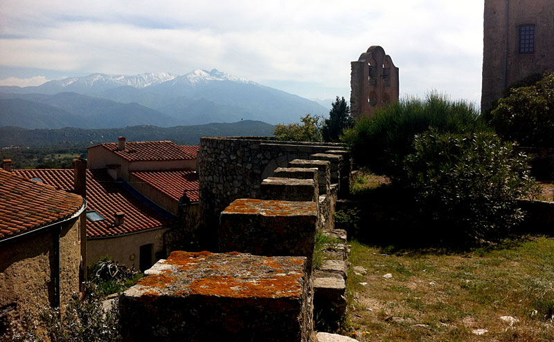
Montalba-le-Château welcomed us with a warm and sunny weather. The castle looked like the right place to isolate ourselves from any distraction and to focus in our porjects. This has been probably the most intense and productive of our workshops. Four days of hard work resulted in the consolidation of the three projects, which was the main goal of this meeting. There is still a lot of work ahead but the main guidelines of our projects are already set. Qandus, Tubqal and Al-Zahra, the three type families, have completely different approaches and are devised for different purposes. Qandus is a display font based in the work of the Moroccan calligrapher Al-Qandusi. Tubqal is a rational sans for long texts based on the mabsut variant of the Maghribi style of calligraphy. Al-Zahra is the most experimental and will play with the horizontal vs. vertical stress angles that make Latin and Arabic calligraphy so different.
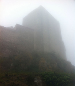
Montalba said goodbye in a smoggy, opaque and mysterious atmosphere. What these three diverse projects will look like in our next workshop in Amsterdam remains also a mystery. We will have to wait to reveal it.
We use cookies to improve your experience and to analyze site usage. You can accept or manage your preferences. Refusing cookies may affect some features.
Functional
Always active
The technical storage or access is strictly necessary for the legitimate purpose of enabling the use of a specific service explicitly requested by the subscriber or user, or for the sole purpose of carrying out the transmission of a communication over an electronic communications network.
Preferences
The technical storage or access is necessary for the legitimate purpose of storing preferences that are not requested by the subscriber or user.
Statistics
The technical storage or access that is used exclusively for statistical purposes.The technical storage or access that is used exclusively for anonymous statistical purposes. Without a subpoena, voluntary compliance on the part of your Internet Service Provider, or additional records from a third party, information stored or retrieved for this purpose alone cannot usually be used to identify you.
Marketing
The technical storage or access is required to create user profiles to send advertising, or to track the user on a website or across several websites for similar marketing purposes.